
Chaos Bewitched
; or, on Jean-Michel Basquiat's boggy, soggy, squitchy Moby-Dick pictures

Note: This is a rather late edition of the newsletter but here’s something to tide you over during the holidays. I have a few good ones queued up for the new year — see you then!
When Ishmael first enters the Spouter-Inn, he stops in the entryway to inspect a large oil painting “so thoroughly besmoked, and every way defaced” that he can hardly understand what he’s looking at. It was a “boggy, soggy, squitchy picture” with “unaccountable masses of shades and shadows,” which drew him in by its indefiniteness.
Ishmael slowly realizes that he’s looking at a half-foundered ship and a whale impaling himself on one of the boats, in the style of a Romantic painter like Ambroise Louis Garneray whose whaling scenes he later praises. That is, highly spirited but — underneath the smoke and grime — certainly coherent and understandable to viewers.
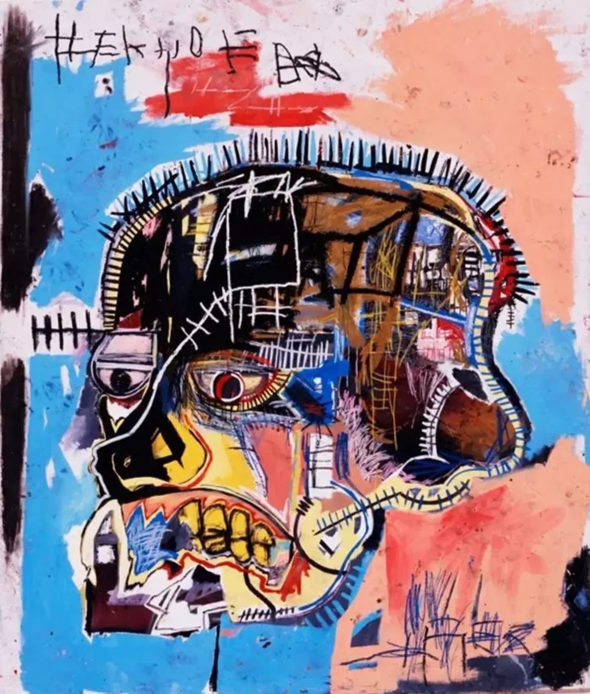
We can only wonder what Ishmael would have thought of the art that was popular when Moby-Dick finally found its audience after seven decades of receiving those same confused, squinting looks. Melville might have fallen out of his whale boat to find that his masterpiece, when reinterpreted by the 20th century masters, looked less like a Garneray or J. M. W. Turner and more like a Jackson Pollock.
#/media/File:Whalers_MET_DP169567.jpg)

I’ll come back to Pollock’s 1943 “Moby Dick” painting another time, but my interest here is in another iconic 20th century artist, Jean-Michel Basquiat, who drew several times from the well of the White Whale for pieces which hit that same note of intriguing yet disorienting. I wanted to collect everything that had been said about these three works and find out what Moby-Dick meant to Basquiat. Were they created in admiration of Melville or were they meant to thumb his nose at him — or a little of both?
Now, I’m no art historian (just as I’m no food historian, philosophy historian, or historian historian), but I knew that if I started collecting some standard resources about him and his work I was bound to find some threads to pull. And so began a few months of on-and-off research involving more than a slew of biographies and exhibition catalogs, several trips to libraries around the metro area, emails to experts and personal friends of his, a documentary, and dozens of archival interviews I scrounged up on YouTube.
And after this approach largely failed to address my central questions, I realized that the answers were embedded in the paintings and drawings all along. Literally.

A word of introduction…
Although he likely needs no introduction, it’s worth briefly considering Basquiat’s background and path as an artist before we look at his three pieces which reference Moby-Dick, all of which were done within the last year or two of his short life.
Born in 1960 in Brooklyn to a Haitian father and Puerto Rican mother, Basquiat’s intellect and artistic talent was evident from a young age. By age 11, he was fluent in English, French and Spanish and made frequent visits to art museums around New York City with his mother. As a boy attending an elite private school (his father was an accountant), he artistic endeavors began by creating his own children’s books before moving on to learning the human form by copying figures from Gray’s Anatomy.
A series of misfortunes as an adolescent, however, threw his life into an ongoing tailspin, including serious injury after being hit by a car, his parents divorcing, his mother’s committal to a mental institution, and being taken to live in Puerto Rico by his father. At the age of 15, Basquiat ran away from home and slept on park benches, beginning to experiment with psychedelics. After being expelled from a last ditch attempt to finish his education at an alternative high school (principal, cream pie), he instead left home for good and became involved with artists and musicians in the gritty Manhattan scene of the late 1970s and early 1980s.
All of these experiences laid the groundwork for Basquiat’s deeply cultured, yet frenetic art beginning by becoming a well-known graffiti artist using his “SAMO” tag (an abbreviation for the phrase "same old shit") alongside provocative messages. From almost the instant he moved to painting canvases around 1980, his work was recognized by dealers and gallery owners as being sui generis and, for better or worse, highly marketable. By 1982, he was already one of the most celebrated new artists in the world, hanging his paintings side-by-side in galleries with Andy Warhol, Cy Twombley, and Gerhard Richter.
Basquiat’s work was characterized by its palpable energy, layered imagery, and complex symbolism, often addressing themes of race, inequality, and the Black experience in America. Paralleling the ways that early hip-hop MCs were sampling records across genres, his paintings paired bold, childlike scrawls with references to African and African-American culture, music, literature, and even cartoons and comic books, creating an immediately recognizable style of his own.
His meteoric rise to fame, especially his celebrity within elite New York City circles, meant that his paintings were virtually sold before they were even painted. His pockets bulged with money and in February 1985 he appeared on the cover of the New York Times Magazine in a feature titled "New Art, New Money: The Marketing of an American Artist." As Richard D. Marshall, an art historian, curator, and expert on Basquiat, wrote, Basquiat “first became famous for his art, then he became famous for being famous, then he became famous for being infamous.” As is all too common, though, the pressures of fame and exploitation as an artist led to struggles with mental health and addiction. In 1988, he died as a result of a heroin overdose at just 27 years old.
Before we look at the works which reference Moby-Dick, I wanted to give one last note from Larry Warsh, editor of a book of Basquiat quotes to give some context to the pieces which, like Melville himself, are a bit on the wordy side to say the least. Though there are plenty of notable exceptions, Warsh writes that “Almost every work Basquiat produced contained some form of written word,” positing that “had he reached artistic maturity at a slightly earlier (or later) time, Jean-Michel Basquiat would have manifested as a poet.”
[W]riting was always central to Basquiat’s artistic practice. From his early collaborative work as SAMO©, a text-based take on graffiti he produced on the streets of New York City from the late seventies through the early eighties, to his ongoing studio practice where text was integral to his visual vocabulary, the shards of language, often elusive in exact meaning and posed in the savvy staccato of urban vernacular, come together as a patchwork quilt of offhand provocations throughout his oeuvre into an extended, improvisatory kind of epic poem. Typically scrawled across his artwork in his characteristic all-capital letters, be it as enigmatic asides or titular titles, Basquiat’s texts within his canvases are as much a part of what he told us as the sum of those few interviews he granted in his lifetime.
So, without further ado, let’s look at the pieces in question, one a painting (of sorts), one a drawing (of sorts), and one a sculpture (of sorts).
Melville (1987)
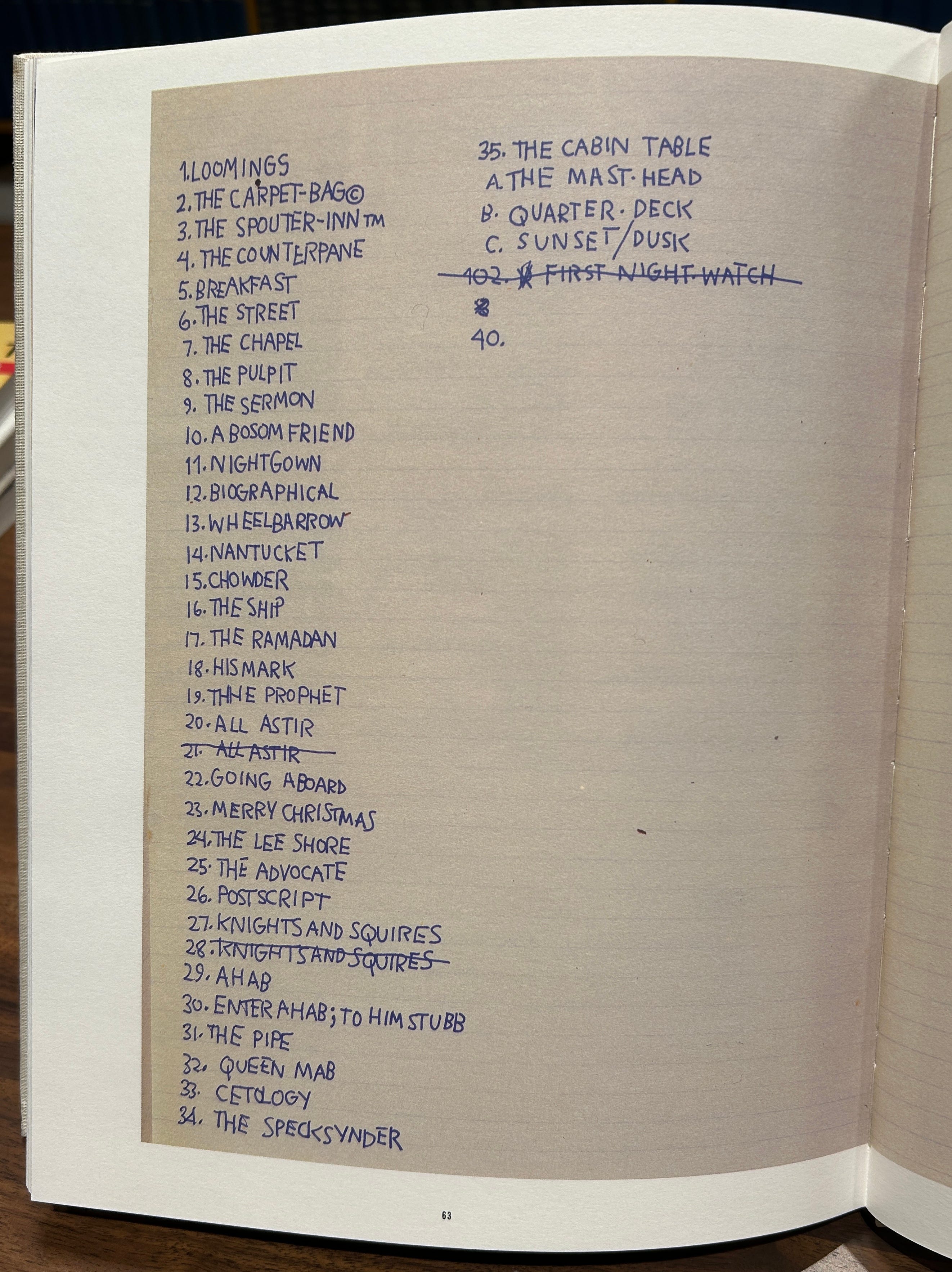
Although it wasn’t first chronologically, the work that addresses Moby-Dick most head-on is “Melville” from 1987, comprising a list of all 135 chapter titles from Moby-Dick across nine pieces of paper. (For a sense of scale you can see the framed piece in this video taken at a 2015 exhibit.)

“Suggesting a kind of found poem,” as the New York Times described it, the piece is provocatively understated and challenging to viewers’ ideas of art that belongs in galleries. But the context of Basquiat’s background suffuse the piece with additional meaning and reframe surface level interpretation, bringing to mind questions such as whether it was meant as a challenge to the book’s cultural hegemony and, in particular, what it means for a black artist to appropriate the great white book about a great white whale. Basquiat even distributes his own copyright and trademark symbols throughout the work as if planting a waif pole on the chapters he liked the most. These symbols show him “sarcastically commenting on the obsession with legitimacy, ownership, and authorship,” writes Marshall.
The piece seems to have sprung from an idea scrawled in his notebook where he started writing out chapter titles, quitting about a quarter of the way through. The page from his notebook was displayed in a 2005 exhibit showcasing his text-based art titled “In Word Only,” reproduced in the exhibit’s catalog.
The final presentation also calls to mind similar work by artists like Cy Twombley, and has connections to Basquiat’s own previous work such as “Untitled (Sykes, Roosevelt)” from 1983, in which Basquiat alphabetically listed names and places from the index of a book about the history of black music.

Marshall continues: that “this endeavor suggests an overly compulsive behavioral quirk operating concurrently with a Zen-like, meditative focus similar to that of a monk copying long, detailed scriptures into leather-bound books over weeks and months.” Mirroring this thought on the Melvillean side of things, Elizabeth Schultz writes in Unpainted to the Last: Moby-Dick and Twentieth-Century American Art that “In his repetition of Moby-Dick's chapter titles, Basquiat makes a rosary of them, a strategic spell that simultaneously protects him from the novel's potency as a cultural icon and speaks of his pleasure in manipulating them.”
Moreover, Basquiat expert Dieter Buchhart distinguishes “Melville” as being unique among his many textual drawings in that rather than the fragmentary, disconnected words and phrases often scattered around his canvases, this one reproduces the entirety of the table of contents start to finish (and then some), uncharacteristically obsessed with a single idea.
Whether Basquiat chose Moby-Dick as his subject because he revered Melville's epic American classic, or whether he was simply drawn to the rich variety of language and range of allusions in the chapter headings, his choice to recast and condense this monumental novel to such a small scale is both an homage and an inspired gesture of reinterpretation, inverting the epic to the miniature.
A closer look at the piece shows that Basquiat actually makes a number of changes to the chapter list to make it his own. In addition to the copyright signs, for instance, all of the chapter titles are presented without articles like “the” or “a”, and several other words are crossed out or corrected. Then, when he reached the end of the table of contents, he continued with:
The numbers 104 through 135, presumably referring to chapter numbers (corresponding to the top of the middle page starting with Chapter 104: The Fossil Whale)
The translated words for “whale” from Etymology, with the Hebrew and Greek translations crossed out;
Short snippets from Etymology (“threadbare in coat…”) and Chapter 1 (“Call me Ishmael™”); and,
A few last words on the final page again all related the early parts of the book: “Etymology,” “Hackluyt,” and “Extracts”
In other words, there’s a clear focus on just the first few pages of the book. The particular selections also all seem to have personal meaning to the former homeless graffiti artist, perhaps finding resonance in the image of a threadbare coat and the tag-like assertion to the world to call him Ishmael. Call him SAMO. And what is the etymology chapter if not a brief provocation on the concept of names — signifier and signified — and an animal which, after all, neither named itself Moby Dick nor the Whale. Schultz writes that their inclusion “can only suggest his empathy with Melville’s pale usher and Ishmael, with the desperation of his homeless contemporaries and perhaps himself.”
As I discovered, the piece also figures into the end of Basquiat’s life in a surprising way. As mentioned, his skyrocketing path to fame led to an unbearable amount of scrutiny from critics and a skeptical public who couldn’t see past his origins as a graffiti artist. Tired of defending his work to white art critics, he allowed fewer and fewer interviews and became reclusive even to friends as his addiction issues grew.
The bottom dropped out after the death of Andy Warhol, his friend and mentor, in February 1987. Art dealer Vrej Baghoomian approached Basquiat around this time to represent him, but found that he had little interest in art. “He was really depressed. He was down,” recalled Baghoomian. “Everything about him and his studio was gloomy. He had a lot of personal demons. He wasn’t doing art. He was doing drawings on paper upstairs, just lying down.” Might this include “Melville,” I wonder?
Baghoomian set Basquiat up with an assistant and over the next year or so was able to cobble together enough work to display at his gallery in Greenwich Village in a show running from April to June 1988. The show at Vrej Baghoomian would be Basquiat’s last before his death barely two months later in August 1988. In fact, the set of photos of him at the gallery, taken by his friend Mark Sink just before the end it came down in June, are the last I could find of him anywhere. Famously, one of them shows Basquiat standing in front of another painting beside the words “MAN DIES.”

Less noted as being present at that exhibit was “Melville,” which I spotted as I went through the collection of photos on Getty. Is it any less notable that those chapters include words like Loomings, Castaway, Sunset, Fossil, Dying Whale, and Needle?

At the risk of overanalyzing the piece and fitting it just so into the narrative of his life, Francesco Pellizzi reminds us that Ahab’s death is tragic because it’s self-inflicted, a fate with which Basquiat may have identified in the face of his heroin addiction. Pellizzi also wonders about what the imagery and symbolism of the book meant to Basquiat, recognizing that it is, after all, the white whale who wins in the end.
The white Leviathan—an image of the dominant state that must have been quite significant for Basquiat—is still the ‘winner’, in the end, even against the maniacal hatred of his enemy, and victim: the ‘narrator-artist’, the lone survivor, is a witness to the ‘general’ madness, the violence and destruction. So what remains for him, like the precipitate of an alchemical distillation, are just the words, the single words, that punctuate the story like a constellation of sign-posts.
Pellizzi, incidentally, was listed as the owner the drawing as of 1995 when Schultz published her book. He died in August 2023, though it might still remain in the possession of his estate which began auctioning off his Basquiats earlier this year.
Untitled (1986)
The second piece referencing Moby-Dick is an untitled painting dated as being from a year before “Melville,” but which clearly sprung from similar ideas and maybe that same page of his notebook. Sometimes referred to as “Untitled (Savoy)” for one of the more prominent words, Schultz describes it as “a bricolage as pregnant with meaning as Queequeg’s tattoos.”

To get a sense of the scale of the piece, measuring nearly 8 feet tall by 11 feet wide, here it is on the wall of the Brant Foundation where it was exhibited in 2019.

At the center of the painting is a large triangle overflowing with images and text, dotted with recognizable imagery like the Batman logo; the CBS eye, and the MAD Magazine logo. There’s also the Charlie Parker record “Billie’s Bounce” issued by Savoy Records as well as a snake, hobo symbols, and, most prominently, a large white bird set against a vivid blue background. The text includes several lists and repeated words such as SHINING SHOES IN ST. LOUIS and a passage that originally appeared as a SAMO text: “THE WHOLE LIVERY LINE / BOW LIKE THIS WITH / THE BIG MONEY ALL / CRUSHED INTO THESE / FEET©,” connecting the painting to his early days as a young graffiti artist.
The connection to Moby-Dick is more evident when you zoom in a bit. Toward the bottom-right of the triangle you’ll find those same chapter titles mostly in a single list but with a few others strewn throughout a few feet of canvas. Notably, the word Hyena (Chapter 49) is written more than 20 times, “as if he is laughing hysterically, over and over” per Schultz. Though, for what it’s worth, the same attention is given elsewhere to other unrelated words such as IMMORTALITY, FLIES, and the phrase “SHINING SHOES IN ST. LOUIS.”

The list continues to the right of the white bird starting with The Funeral. The title of the book, written in block letters, also appears in the top right of the canvas.

Dieter Buchart writes of the painting that “With the buzzing range of references in this piece, Basquiat may have created an unsolvable puzzle, defying specific interpretation,” but points to prominent themes of African American musical traditions, Moby-Dick, and the word “IMMORTALITY” which “recurs like an incantation… immortalizing some of his heroes, along with the whole teeming incidental world.”
Elizabeth Schultz reaches deeper into the painting’s potentially more abstract connections to themes and recurring elements in Moby-Dick, such as E PLURIBUS UNUM ("Out of many, one") on a penny which she connects to the Pequod’s crew being “federated along one keel.” Interestingly, though, she makes no note of the coin being lodged at the near center of the triangle like a certain doubloon. She goes on:
In these works, both the nineteenth-century white author and the twentieth-century black artist compress the "higgledy-piggledy" references, the "random allusions," “sacred or profane" they discover in "the long Vaticans and street stalls of the earth." Whereas both incorporate lists and graphic emblems into their works, Melville's experimentation with genres, rhetoric, and tones is matched by Basquiat's experimentation with cartoon images, geometric design, and color. Their accumulated references may seem ill-digested, gobbled down, but they both synthesize a fascination with the multitudinous signs of their times and their meanings and a frustration with the possibility of reading them.
Schultz also pays careful attention to the white bird with one leg, suggesting “a fragility, a vulnerability with which Ahab would have identified.” She asks: “Does it represent a pastoral moment such as Ishmael discovered in the throbbing heart of the Grand Armada or ‘the bird of heaven’ which, like the sky-hawk in the last chapter of Moby-Dick, is nailed to the Pequod’s mast and dragged down to hell?”
For what it’s worth, I couldn’t find specific information about who owns this painting now besides a note in Schultz’ book that it’s owned by a “private collection” in Zurich. A curator at the Brant Foundation wouldn’t give me any hints.
Untitled (1986)
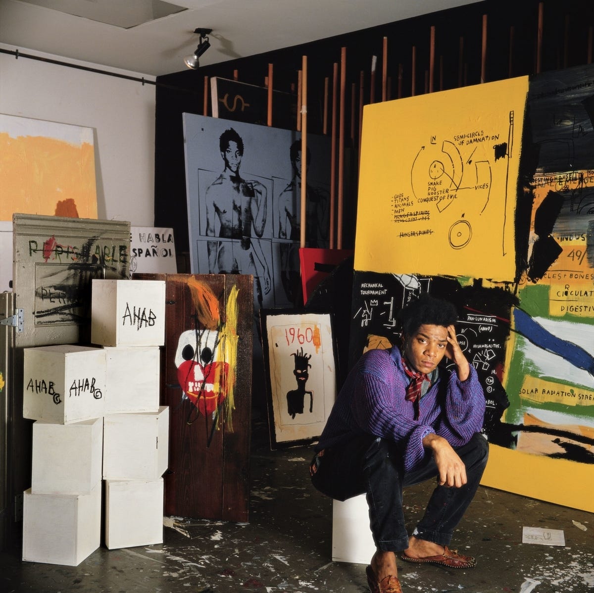
The third, and seemingly least-known piece is another untitled work from 1986, a set of two boxes painted white with the word “AHAB©” written on several sides. In fact, I only became aware of them after noticing them in a photo taken at the recent “King Pleasure” exhibit curated by the artist’s family.

In fact, aside from their inclusion in the exhibit and the accompanying exhibit catalog, I found no other mention of their existence in any of the articles or books analyzing the other two Melville pieces. The only other place I spotted them was in the background a photo taken in his Great Jones Street studio/apartment.
Boxes and other three-dimensional canvases might not be the medium for which he’s best known — after all, he created just 30 sculptural works compared to about 700 paintings and 1,000 works on paper — but Basquiat was actually known to paint on just about any surface he could get his hands on, including refrigerators, lab coats, cardboard boxes, and doors. Some of his earliest non-graffiti work was actually painted on doors he found on the street, and incidentally, his last known work just before his death may also have been on a door.
Among the most notable sculptural works in the vein of the Ahab boxes is this one from 1982, featuring the cryptic phrase “HEAD OF A FRYER” written on a box atop a wooden step stool inscribed with the words “SARCOPUGUS [sic] OF A PHYSICIAN.” On another side of the box is his signature crown symbol.
 by Jean-Michel Basquiat – Artchive")
One of his largest sculptural pieces, Brain, is composed of twenty-seven boxes covered with Xerox paper featuring some of Basquiat’s favorite motifs: masks, faces, anatomical drawings, and record labels. The boxes are topped with a bootblack stand, bearing with the word “BRAIN©” written and crossed out.

In lieu of any expert analysis of the Ahab boxes that I could find, there’s at least this note from Christie’s auction house on his sculptural work when they sold “Brain” in 2023, commenting that the piece “expands the discourse on Basquiat’s oeuvre,” which has traditionally focused on his paintings, and “shows him at his most innovative as he refused to be limited to just one medium or subject matter.” The readymade object of the bootblack’s stand, they write, is “especially important because of its alignment of Basquiat with a history of sculpture” such as Duchamp’s “Fountain.”
The Ahab boxes, in comparison, come across as relatively straightforward and thus open to even wider interpretation. The whiteness of the boxes speaks for itself, and as in the novel Ahab is ‘attached’ to the back of the whale for all eternity. Are they meant to be Ahab, the whale, and Ishmael’s coffin-buoy all in one, or are they simply inscrutable like the whale? Feel free to opine in the comments.
In the meantime, I had a few other questions about these works that I wanted to answer.
Did Basquiat own/read a copy of Moby-Dick?
On its face, the question of whether Basquiat owned a copy of Moby-Dick appears, well, insignificant. But I wanted to dig further into the artist’s actual feelings about the novel and what it meant for him to use (and reuse) significant elements from it in his own work. Schultz, for instance, believes that Basquiat’s work “demands that Moby-Dick, as a written document, be accountable,” scrutinizing its status as a “veritable cultural bible.”
Such iconizing these young American artists with Puerto Rican and African backgrounds scrutinize, questioning not only its validity but also the novel's relevance for their lives. Despite the spirit of inquiry infusing Moby-Dick and despite its radical stance on racism and slavery, as "the great American novel" and one written by "a dead white male" and about a great white whale at that, Melville's novel carries heavy cultural baggage to which nonwhite readers have responded by thoughtful investigation and ironic subversion.
But the more I read about Basquiat, his work, and his interest in American literature 19th and 20th century literature — especially writers like Mark Twain, William S. Burroughs, and Jack Kerouac — the less sure I was that he was thumbing his nose at Melville in these works. After all, his inclusion in “Untitled” of Charlie Parker records, the Gospel blues song “John the Revelator,” and even references to his own graffiti surely wasn’t meant with ironic subversion. Is it so hard to believe that Basquiat genuinely admired Moby-Dick and felt so inspired by it to create a piece which juxtaposed it’s skeletal table of contents with other of his favorite cultural touch points?
After all, if we can determine that he even read the book, it’s not so hard to believe that Basquiat identified with Ishmael the penniless castoff, the autodidact soaking up the world’s knowledge, the observer, the writer, the world traveler. But first there was much more to learn about his relationship to the book.
Unfortunately, the most explicit comment on his relationship with the book came from Marshall, who essentially answers the question with a big shrug and by casting doubt on whether Basquiat read any of the source material for his texts.
It is not clear if Melville's epic held a special appeal for Basquiat, if he identified with any of the characters, if the story had a metaphorical significance, if he had read the book, or if he was merely attracted to the detailed, descriptive chapter titles with corresponding page numbers. Basquiat freely admitted that he copied names out of tour books, condensed histories, and novels simply because he liked names, numbers, chronologies, diagrams, and the logical, alphabetical organization of vast amounts of information and history.
Marshall, however, wrote this analysis twenty years ago for the 2005 “In Words Only” exhibit catalog. He also died in 2014, leaving me no choice to contact current art historians, colleagues, and friends of Basquiat’s and ask if they could shed any new light on this question. One curator and historian politely responded that no, this was really the last word on the subject. “I hold Richard Marshall’s work on Basquiat as essential,” he emailed me, “especially considering how much ahead of everyone he was in going into specific topics.”
Well, Ahab’s compliments to ye, as they say, but come and see if ye can swerve me. The path to my fixed purpose is laid with iron rails!
It was clear from several biographies and interviews that Basquiat was a big fan of authors like William S. Burroughs, John Giorno, Mark Twain, and especially Jack Kerouac’s Subterraneans, which he not only owned but apparently brought with him everywhere he went. In fact, he was photographed with a copy for the invitation to the 1988 exhibition at Vrej Baghoomian where “Melville” was shown.

In other words, it’s not as if he universally held white authors of the 19th-20th century canon in low regard, fodder for his artistic taunting.
Having the titles of a few other favorites, I was finally able to find a reference to the books that were part of Basquiat’s “eclectic collection” in Reading Basquiat: Exploring Ambivalence in American Art by Jordana Moore Saggese, Professor of Modern and Contemporary American Art at the University of Maryland. Saggese writes:
One of Basquiat’s most comprehensive inventories of words comes from Herman Melville’s 1851 novel Moby-Dick, which sat on Basquiat’s bookshelf among an eclectic collection of literature: Homer’s The Odyssey, Louis-Ferdinand Céline’s Journey to the End of the Night (1932), William Burroughs’s The Ticket That Exploded (1962), Daniel Defoe’s Robinson Crusoe (1719), Three Plays of Euripides, Kerouac’s The Subterraneans (1958), Ray Bradbury’s Fahrenheit 451 (1953), an encyclopedia, and a textbook on the Golden Age.
But then, another bewildering setback. When I finally got my hands on a copy of the “King Pleasure” exhibit book, I found that, amazingly, it included a comprehensive catalog of every book, movie, and album that he owned at the time of his death. Except, none of those books were on it.
In the “Literature” section of the inventory there’s the Complete Poems of Robert Frost and Ginsberg’s Howl. In other sections of the list are cookbooks from Chez Panisse and Julia Child, books about Hollywood and jazz legends, and New York City guidebooks.
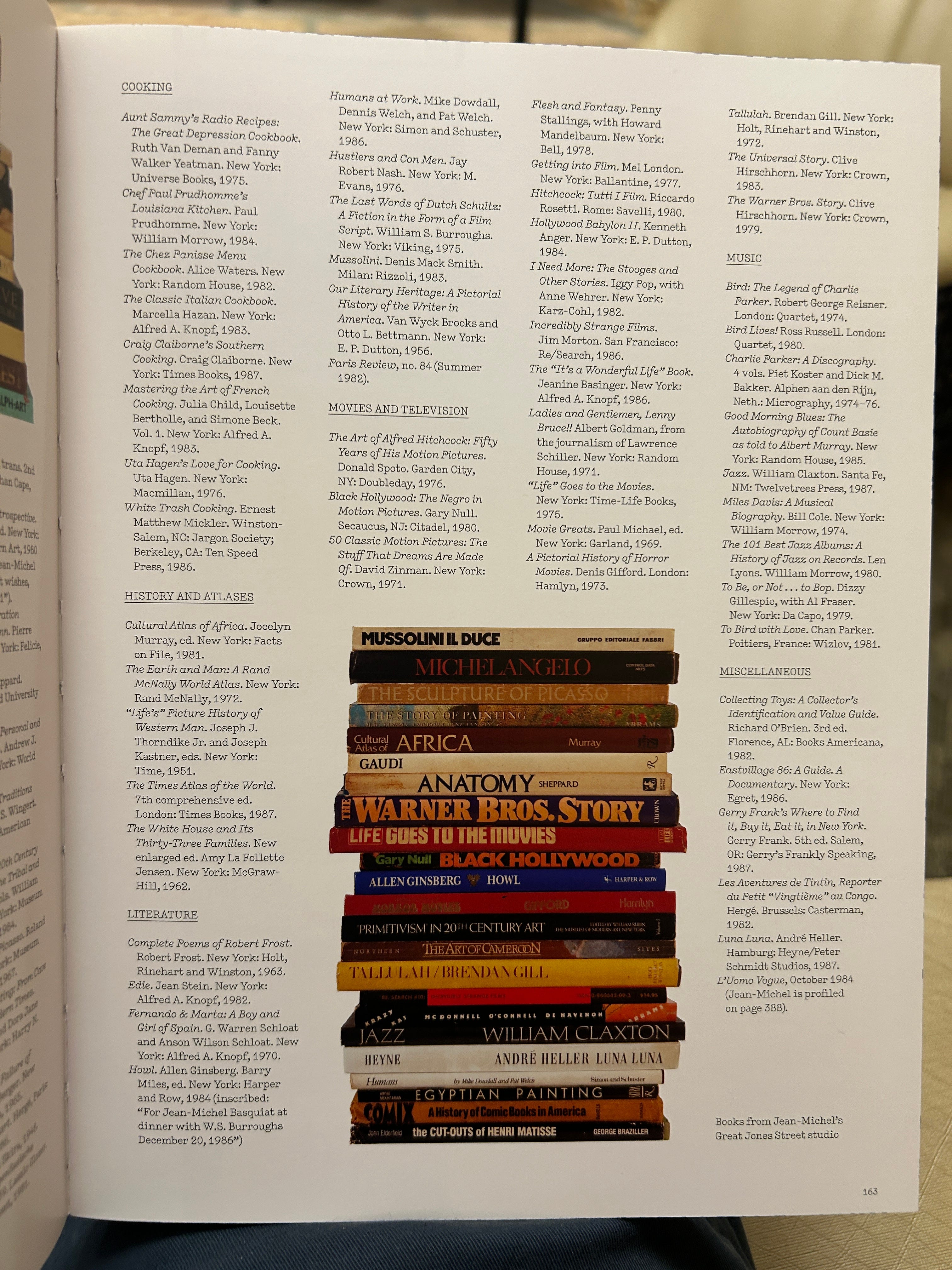
But there was no Moby-Dick, no Subterraneans, no Journey to the End of the Night, or any of them. Well, that’s not to say his collection was completely devoid of Moby-Dick. According to the inventory of movies he did own a VHS copy of John Huston’s 1956 adaptation. But clearly that wasn’t the source of 135 chapter titles which he scribbled down one by one. So where was the book? I wondered if there was a way to back my way into an answer. Was it possible to figure out which edition he was using through other means?
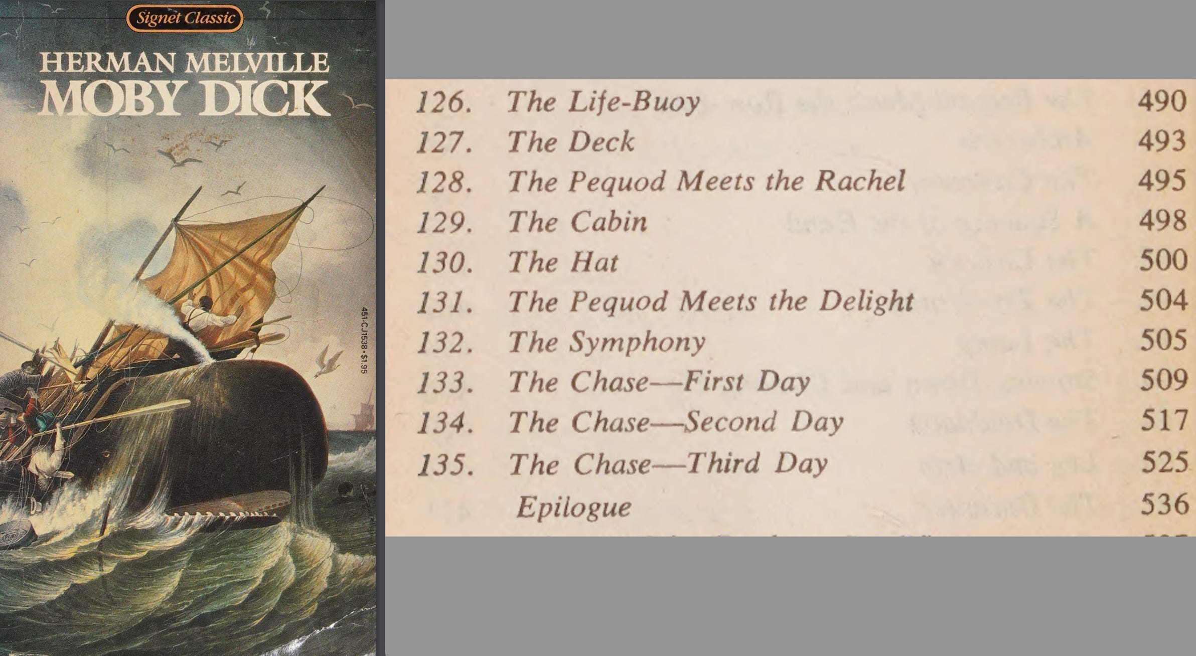
Perhaps you noticed that a single page of “Melville” includes what look to be page numbers beside the chapter titles. It was a long shot, but I thought there might be something to it.

Considering that the short Epilogue almost always fits onto a single page, it seemed that the text of this edition book excluding any afterwords, etc. should land at exactly 536 pages. In my experience (i.e., someone who owns a few dozen copies of Moby-Dick) this suggested a more stout, pocket-sized edition. I also wondered which copies would be most common in the mid-1980s, maybe something so commonplace that it could have been given away and no longer in his possession when he died.
After checking just a few copies on my shelf I had a winner: the chapters and page numbers matched the 1980 Signet Classics edition pefectly.
Not only do all of the chapters and pages line up, the year it was published (1980) also lines up nicely with his lifetime and when he might have read it. Forty-five years later this copy is still ubiquitous and was presumably even more so in his day. Bearing in mind the numerous misspelled and crossed-out chapter titles in the piece, you can almost imagine him fighting to keep the spine of the paperback open, holding a few in his mind at a time and going back to check his work.
That said, I also noticed on the title page that this edition was actually the third printing, meaning there had been two others which had the same typesetting and page count. You might also recognize the previous edition from 1961 with a cover showing Ahab holding a spade and what looks to be a Moby Dick stuffed animal — almost a satire of “American Gothic.”

The first edition, from 1955, was released in anticipation of the upcoming film.

I wondered if there a way to figure out which of the three Basquiat used to copy out the chapter titles, and had a revelation. Look again at the logo he included in “Untitled (Savoy)” toward the upper right of the canvas.

Look familiar? To me this actualy looks a whole lot more like the 1961 edition than the others, especially in the shapes of the B, Y, and especially the slanted I — though admittedly not every letter is a match. It’s notable also that it’s the only one of the three editions that puts the title on two lines like Basquiat does.

Maybe it’s still insignificant, but Basquiat left us a trail of breadcrumbs and I’ll be damned if I’m not going to follow each one until the end.
An Anachronism and An Answer
None of this, however, explained what he thought of the book and there was seemingly nowhere left to go. But just as I was accepting that I would have to admit defeat, I made an interesting discovery.
When I started research for this post, I watched Tamra Davis’ 2010 documentary "Jean-Michel Basquiat: The Radiant Child” to learn more about the artist in general, but also hoping that it might make some mention of the books he liked or that I might even spot the pieces in his studio. Davis, I should mention, was a close friend of Basquiat’s though later became better known for directing “Billy Madison” and “Half-Baked,” of all things.
As I finished drafting this post, though, I went hunting for a quote I wanted to use but misplaced, and skipped around the film trying to find it. Suddenly, there it was. Just barely in the frame, in a shot lasting just a few seconds, was the white whale shoved nearer to the left side of the screen. This was the best of about 10 frames of the film:

In this moment of the film, one of Basquiat’s friends was describing in a voiceover how, when he became wealthy almost overnight, he would hide thousands of dollars in cash inside his books. Right on cue, the disembodied hand in this grainy shot opens this book, Burrough’s The Ticket That Exploded, to a stack of hundreds. And floating just in and out of frame is Moby-Dick.
Amazingly, if you look closely the titles on this shelf exactly matched that list provided by Joanna Moore Saggese: The Odyssey, Journey to the End of the Night, Robinson Crusoe, Three Plays of Euripides, The Subterraneans, and so on. It was a hallelujah moment.
I didn’t immediately recognize this edition of Moby-Dick — and it certainly wasn’t one of the Signet Classics — but I could tell a few things about it that might help ID it. It looked to be dark blue in color with white or yellow text. The title was oriented sideways without a hyphen and with the M and D larger than the rest of the letters. The publisher’s name was too blurry to make out, though it looked like it was just a single word. And, logically, it had to have been published before 1988 at the latest, when Basquiat died.
Even with this information, though, I found nothing in image searches and online auction sites that matched. Instead, I turned to two sources to see if they could identify it: Bill Pettit and his massive collection of more than 200 editions of Moby-Dick, and the Melville Society Facebook group. Both sources provided an answer by the following morning.
In Bill’s case, he replied: “Adam. I've attached two pics of what think might be your MD.” It was from the Konemann Classics series, in English but issued by a German publisher. It was undoubtedly the same edition as the one on the shelf.

There was just one small issue. Konemann didn’t publish Moby-Dick until 1996. In fact, Konemann wasn’t even incorporated as a business until 1993. Something was fishy. I emailed the editor of the series to see if maybe there was something I was missing. He delighted in reminiscing about his time working as a translator for Konemann and told me the story of how their English editions came to pass, but said me that, unequivocally, there was no way that shot came from the bookshelf of someone who died in 1988.
I took a chance on what I guessed might be Davis’ email asking in a more roundabout way which of Basquiat’s apartment the shot was from. After all, his frequent relocations between New York and Los Angeles could theoretically help date when he first owned the book.
Tamra responded the next day, solving two mysteries at once in just a few words, written almost as another ‘found poem.’
I wish i could help you.
I know he loved the book.
unfortunately the bookshelf you are seeing is a pickup shot I did of my own bookshelf.
In other words, the shot was faked. The Konemann Classics edition was Davis’ own, as were all the other books Jordana Moore Saggese listed as being in his collection. She’d been duped by not recognizing that anachronistic copy of Moby-Dick.
And Basquiat, far from thumbing his nose at Melville, simply “loved the book.”
References:
In addition to the hyperlinked sources, I relied on the following books, articles, and films for information and background.
Basquiat: A Quick Killing in Art, Phoebe Hoban (1998)
Basquiat-isms, ed. Larry Warsh (2019)
Basquiat: The Unknown Notebooks, ed. Dieter Buchhart and Tricia Laughlin Bloom (2015)
Jean-Michel Basquiat, ed. Richard D. Marshall (1992)
Jean Michel-Basquiat: King for a Decade, ed. Taka Kawachi (1997)
Jean-Michel Basquiat: In Word Only, ed. Richard D. Marshall (2005)
Jean-Michel Basquiat: A Biography, Eric Fretz (2010)
Jean-Michel Basquiat: Drawing, ed. Fred Hoffman (2014)
Jean-Michel Basquiat: King Pleasure, ed. Lisanne Basquiat et al. (2022)
Reading Basquiat: Exploring Ambivalence in American Art, Jordanna Moore Saggesse (2021)
Unpainted to the Last: Moby-Dick and Twentieth-Century American Art, Elizabeth Schultz (1995)
Francesco Pellizzi, “Textual Images and Imaginal Texts: Some Prehistoric and Contemporary Perspectives” (2023)
“A note on Jean-Michel Basquiat’s word-parade,” Francesco Pellizzi (2019)
Jean-Michel Basquiat: The Radiant Child, dir. Tamra Davis (2010)
For someone who isn’t a art historian or critic, you sure do an incredible job writing about art. Thank you for this fascinating piece!
So glad to read this.