
Rockwell Kent Uncovered
; or, 20 Moby-Dick illustrations you've likely never seen before

POP QUIZ: What do Moby-Dick, As I Lay Dying, The Maltese Falcon, The Little Engine That Could, Nancy Drew, Dick and Jane, Betty Boop, and Hoagy Carmichael’s “Georgia on My Mind” all have in common?
The year 1930 in the title of that YouTube video is a hint, but in case you haven’t already guessed the answer is that as of January 1st, 2026 all of these works have entered the public domain after 95 years of copyright protection. Congratulations, they’re yours to use! Reprint them, remix them, sample them, and pay no licensing fee!
Of course, when I include Moby-Dick in the list I don’t mean the original text of the book, which will celebrate its 175th birthday later this year. But just as exciting is that joining it in the public domain afterlife are the nearly 300 illustrations by Rockwell Kent originally created for the three-volume Lakeside Press edition, followed by the Random House trade edition and several others licensing the images. Expect to see several new editions of the book and possibly t-shirts, posters, postcards, baby onesies, beach towels, and breakfast cereals (Cap’n Ahab Crunch?) all using the images and making a fast buck from Melville fans. You’d better believe there’s already a new edition of the book using Kent’s illustrations published on New Years Day.
But this post is more than a mere public service announcement about copyright protection. Rather, unless you’ve really invested time and perhaps $10,000+ on an original Lakeside Press edition and its fancy aluminum slipcase, there’s probably something you don’t know the illustrations: not every illustration from the original made it into the smaller, one-volume trade editions that followed. That’s right — there are 12 images which, unless you’ve flipped through Kent’s original vision, you’ve probably never seen before!
What’s more, even if you have gotten hold of a Lakeside Press edition, there are another eight which Kent apparently decided at the last minute not to use. It wasn’t until May 1977 that these images were quietly published in an issue of the Melville Society Extracts newsletter. But the only low-res digital scans available online to date leave at a lot to be desired.
With all of these images having now reached public domain status, however, I can at last publish them freely here and show you what us plebs have been missing out on for the last 95 years. Kent’s illustrations are no less breathtaking in 2026 as they were in 1930 when they were so celebrated that the publisher staged exhibits in art galleries around the country. To that end, I’ve also included a few side-by-side comparisons between the original Lakeside Press edition and the Random House trade edition to see how even the images we’re used to seeing pale in comparison to those printed in their full glory.
“The confounded state of the Copyright question”
A whole book—or a hefty article at least—could be written about Melville’s troubles with copyright issues when he was publishing his novels. Before international copyright, publishing dates had to be tightly coordinated between New York and London to prevent pirated copies finding their way to bookshelves first. It’s why Moby-Dick (or rather, The Whale) was published in London a few weeks ahead of the American edition, and why his publisher there was able to take liberties like removing “blasphemous” language, shifting Etymology and Extracts to the back of the book, and excising the epilogue completely.
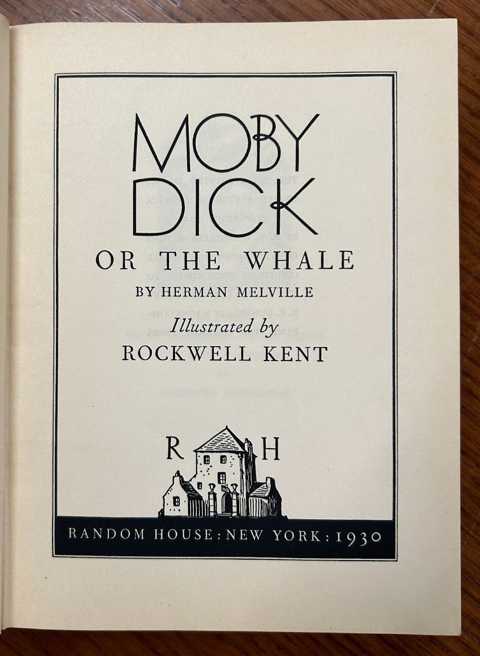
Seventy-nine years later, the Lakeside Press issued their edition of Moby-Dick under a much more modern system though one which continue to develop throughout the 20th century. Kent’s contract also stipulated that he retained ownership of his illustrations, allowing him to license them several times in his lifetime, most notably to the Random House trade edition published simultaneously to the Lakeside Press, but also the 1937 Garden City edition, the 1944 Modern Library edition, and more published internationally.
Just for fun, let’s take a look at the paperwork that’s kept Kent’s illustrations under wraps all these years starting with the application for copyright filed on November 5, 1930 by R.R. Donnelly & Sons, owner of the Lakeside Press. Note that in keeping with the disregard that Random House had for the actual author of the book—famously forgetting to put Melville’s name anywhere on the cover or spine—Donnelly submitted Kent’s name as the author. (The copyright office seems to have corrected the mistake in its ‘official use only’ box).
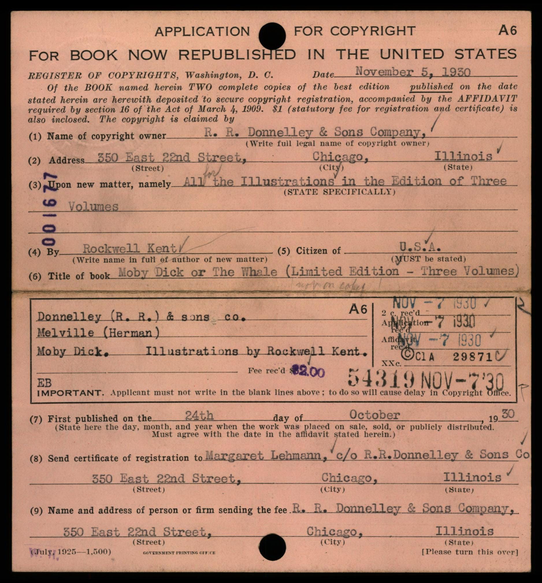
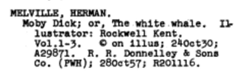
Per the 1909 Copyright Act, R.R. Donnelly’s book and Kent’s images were protected for 28 years, thus we see a renewal of the copyright submitted in 1957, extending the protection for another 28 years through 1986.
I realize the history of copyright law is a real bore, so suffice it to say that the Copyright Act of 1976 and the 1998 Copyright Term Extension Act further prolonged copyright protection to a maximum of 95 years from the date of publication, taking us to—you guessed it—December 31, 2025.
When Kent died in 1971, he passed ownership of his work to his widow, Shirley Johnstone Kent, who died in May 2000. She, in turn, designated in her will the Plattsburgh State Art Museum as the owner of the copyright related to all of his work. The museum, which also hosts an enormous collection and rotating gallery of his work in far upstate New York, has held it ever since.
That is, until three days ago.
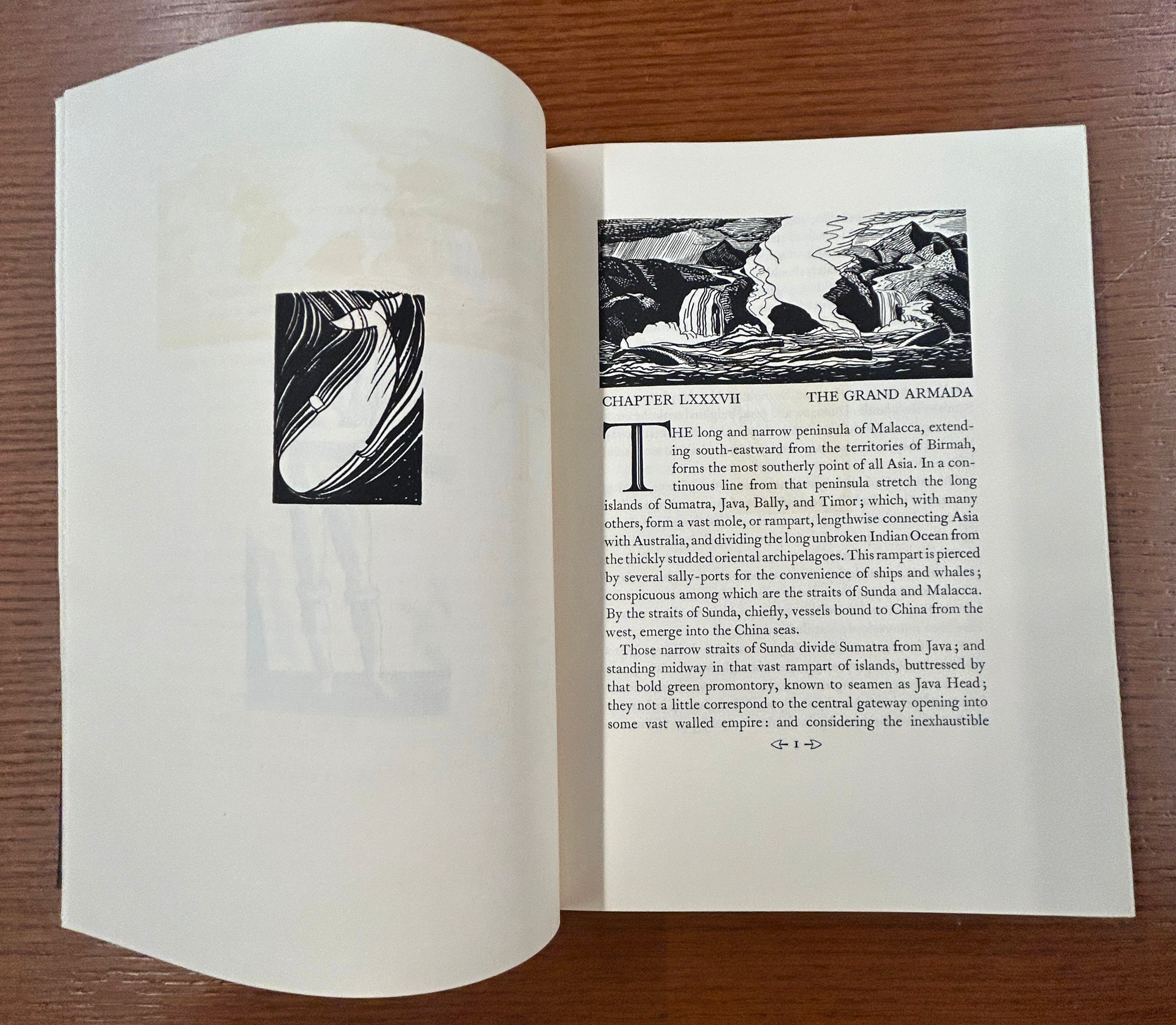
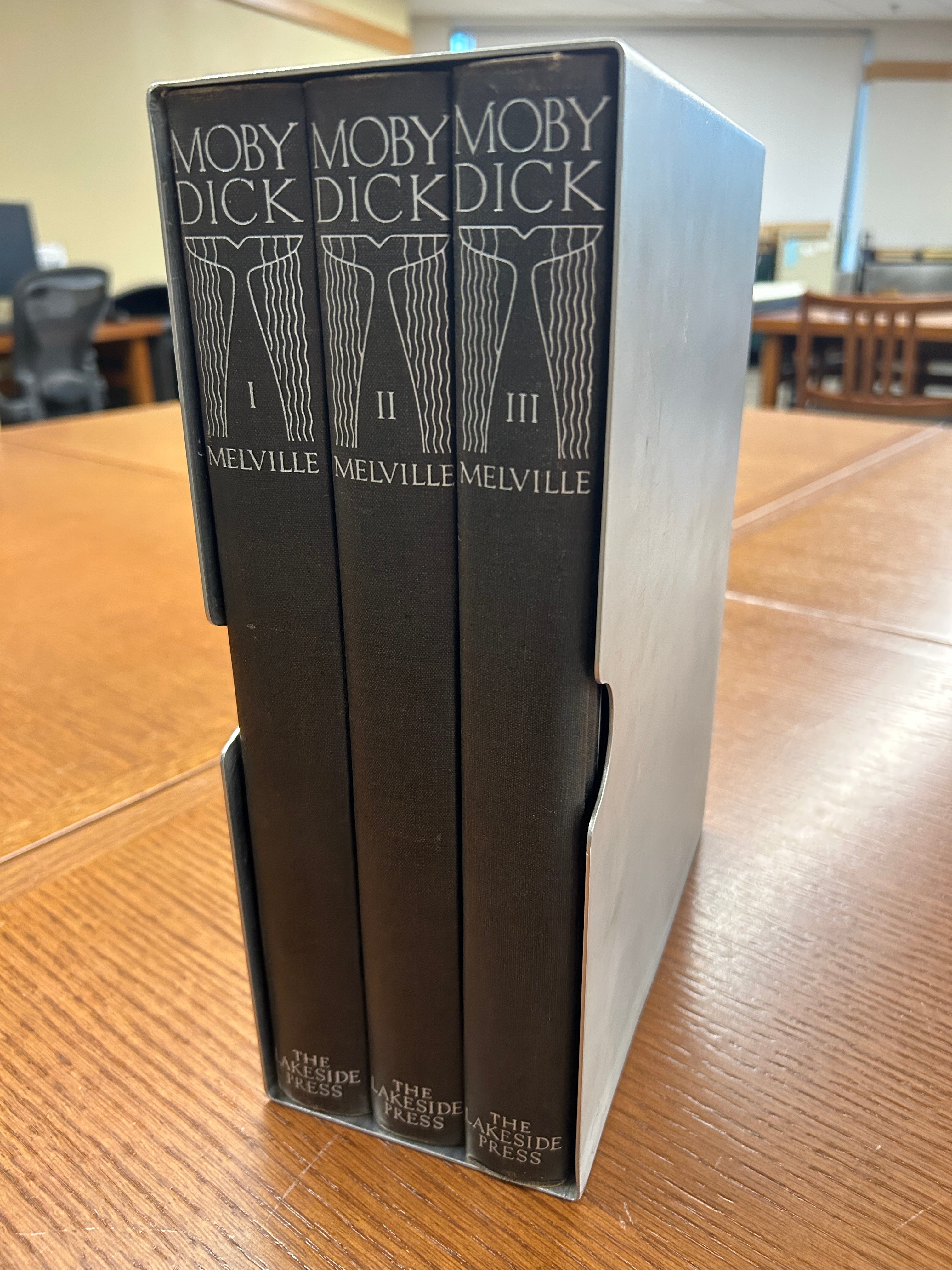
A Wondrous Work in Three Volumes
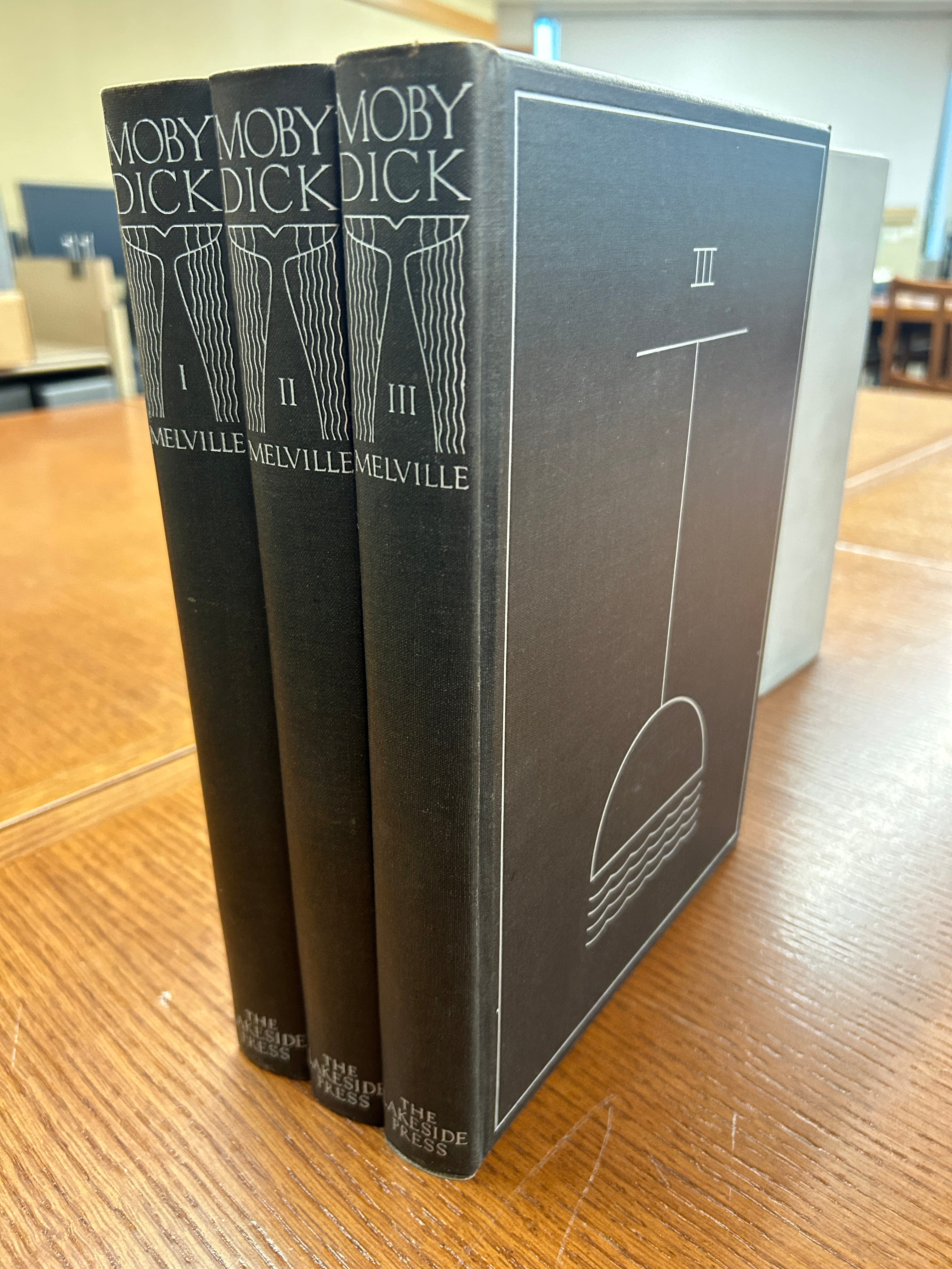
So how did I, a simple sailor, get my hands on a copy of the immensely expensive Lakeside Press edition which typically sell for about $12,000? A sub-sub librarian, of course.
Specifically, it was brought to me by a student aide at the University of Minnesota’s Elmer L. Andersen Library, the underground home of the school’s Archives and Special Collections Department. Though I’m not a student there, all it took was discovering that they hold one of the original 1,000(ish) copies and reserving time in their reading room where it waited for me at a table.
By the way, you too (yes, you!) can sit down with a copy at no expense. Go to the item record on WorldCat and filter by location to find one at a library near you. In most cases you won’t need to have any affiliation with the library or, at most, will need to create an account. Really folks! Take advantage of your local special collections!
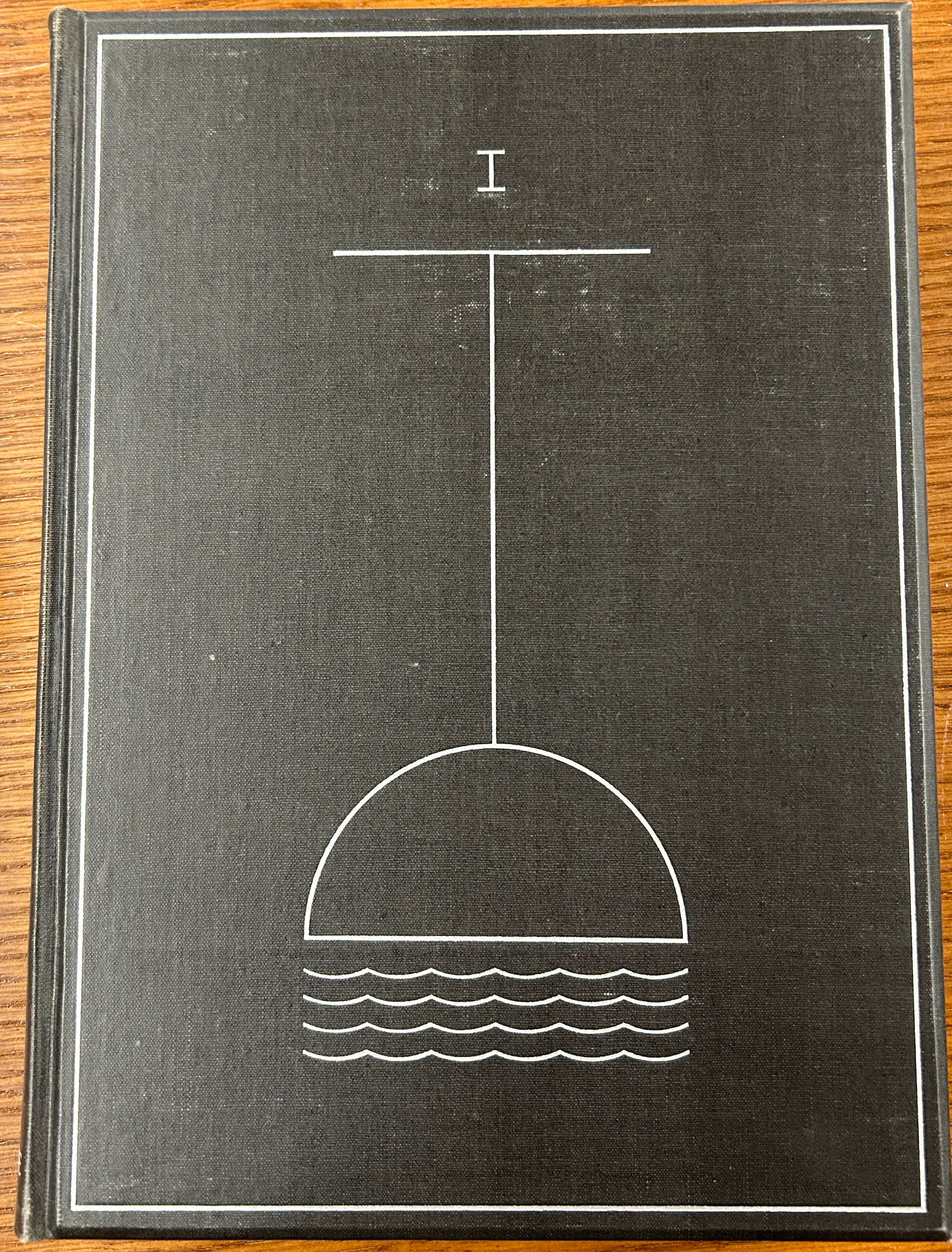
Anyway, with my personal copy of the Random House edition in tow, I compared the two page-by-page to spot any differences, which begin before you even crack the spine. The first thing you won’t see on the trade editions is the highly-abstract line drawing of a whale diving into the sea with the volume number (I, II, and III), with another drawing on the spine which differs from the trade edition as shown above.
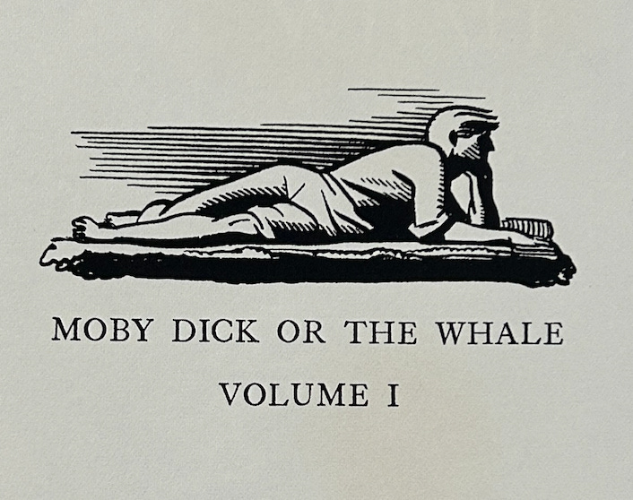
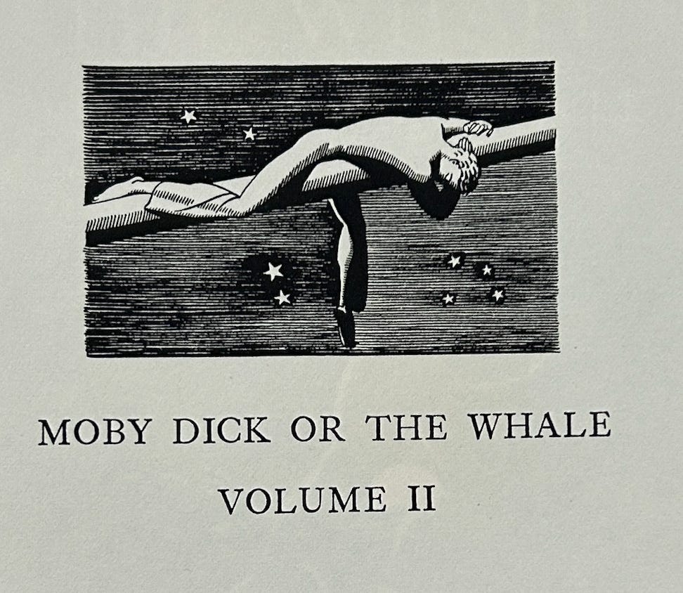
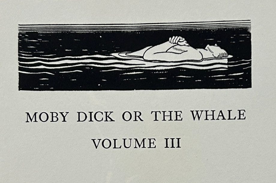
Another notable difference right from the get-go are the stark black title pages preceding each volume with three very Kentian figures in almost mythological poses. Unlike the rest of the illustrations done in ink, the title pages were prints made from copper-plate engravings which Kent etched directly on the metal, calling them “the only black title pages that ever were” in a 1969 interview for the Smithsonian Archives of American Art.
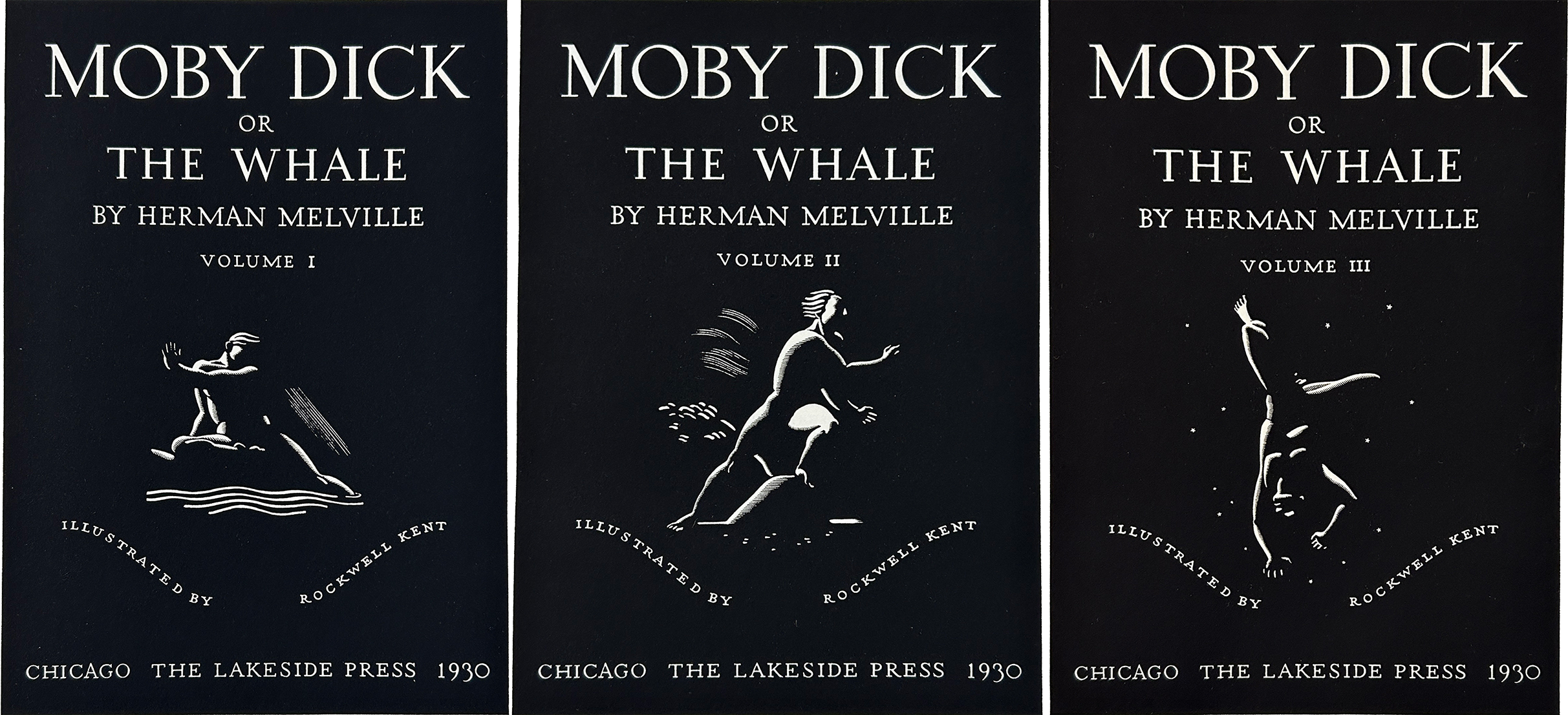
Volume I shows a man hovering above the water with his left arm stretched across his body, almost in a yoga pose. In Volume II a figure leans with one leg on some rock or elbow of land, facing a strong wind. His hair is blown back, and behind him is a tree also being blown backward. There’s maybe even a hint of a beard sticking out from his chin. Volume III shows a man in baggy sailor pants upside down, falling among the stars or possibly sinking below the water.
I’m not sure whether Kent meant for the images to have specific characters or scenes attached to these illustrations, but what immediately comes to mind for me in Volume I is Ishmael’s declaration that “meditation and water are wedded forever.” Volume II is perhaps Ahab in a fighting stance, ready to take on nature itself. And Volume III may then show the fate of everyone else on the Pequod, i.e., slowly drowning.
In any case, compare it to the title page in the Random House edition which does away with these illustrations and the cold, sober serif font and replaces it with large, loopy letters and the publisher’s logo — which, by the way, Kent also designed.
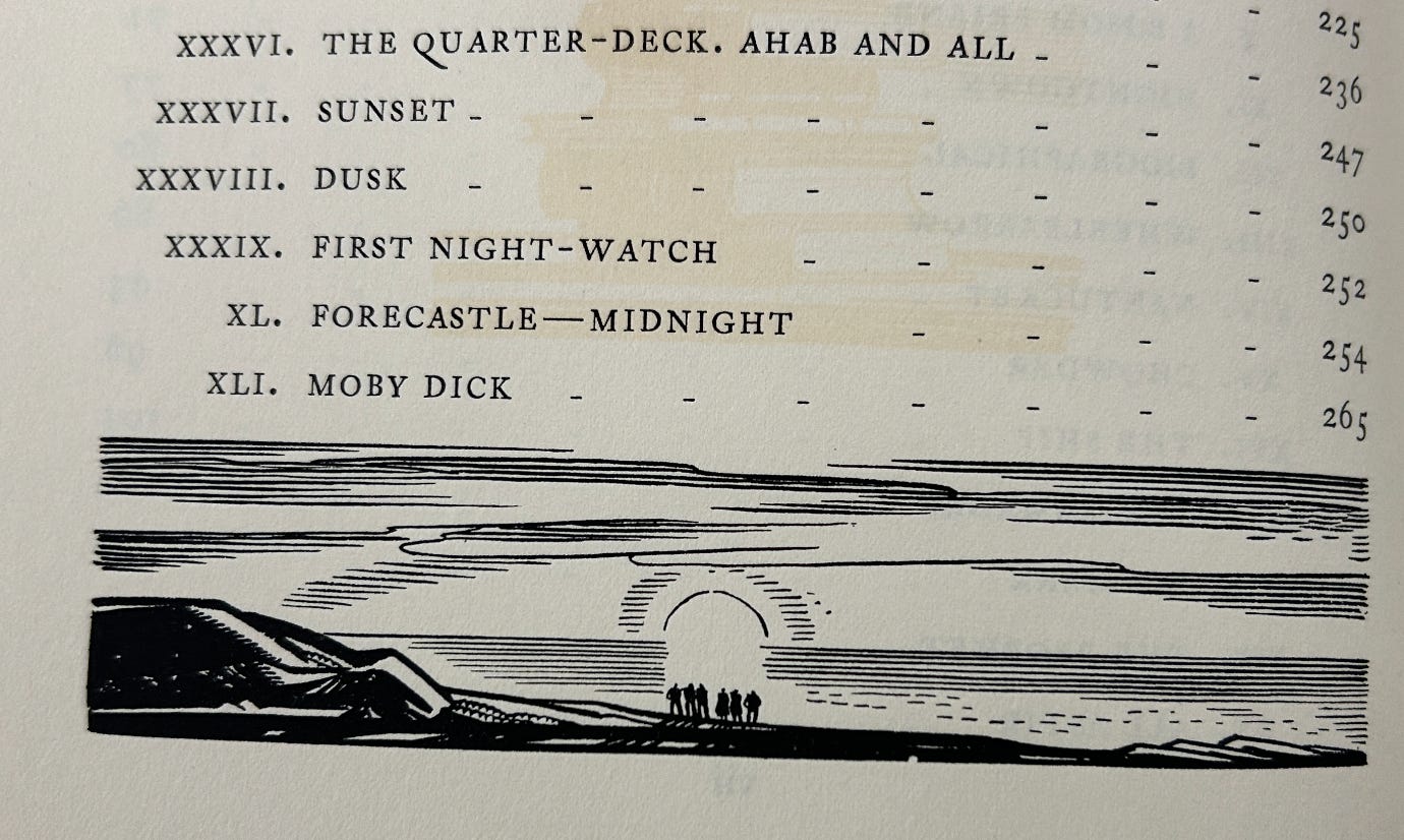
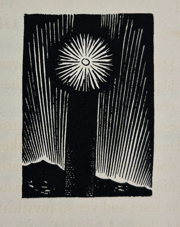
The next image not reproduced in the trade editions is a landscape scene below the table of contents in Volume I. Here we see a group of six people on a kind of promontory watching the sunrise or sunset. Are they one of the crowds of water-gazers gathering at the water’s edge in the insular city of the Manhattoes?
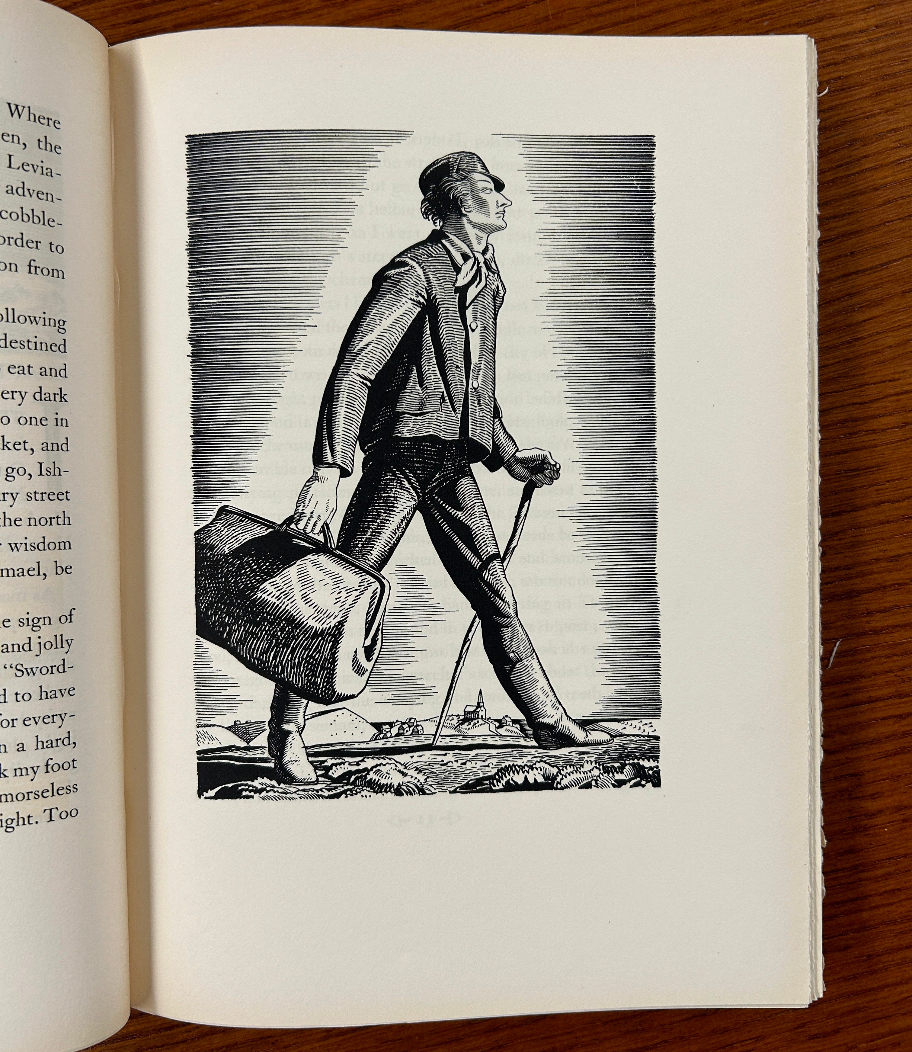
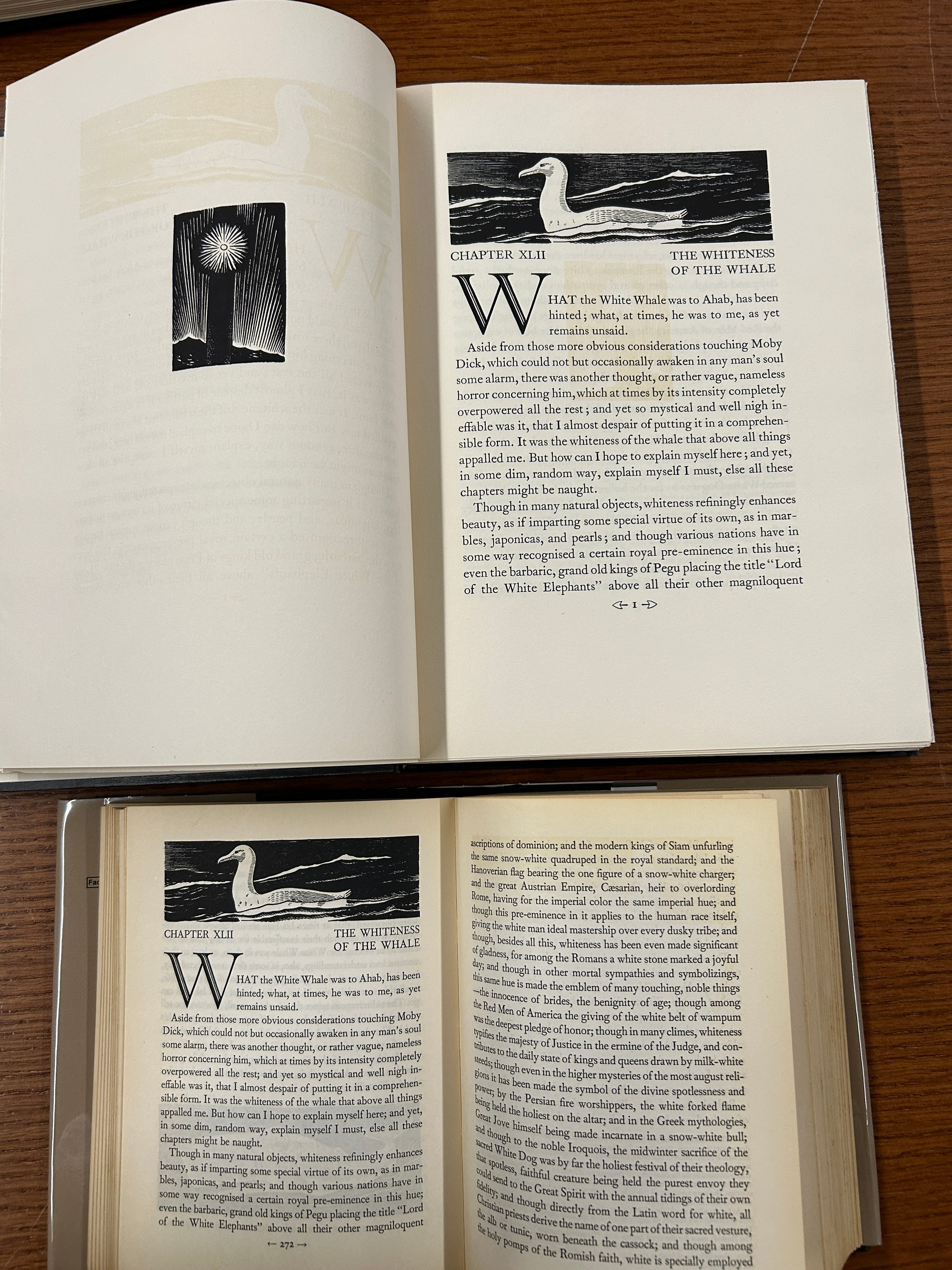
Although you’ll surely recognize this image of Ishmael from the trade editions, I couldn’t help but show here just how immense the images were in the original and with such crisper detail.
The remainder of the illustrations in Volume I, so far as I noticed, were all reproduced in the trade editions, so let's jump ahead to Volume II. Once again, the first difference came before the text began. To back up a bit, the very first illustration inside both the Lakeside Press and the trade editions is this frontispiece, possibly an image of Ishmael on his side leisurely reading a book.
However, because the trade editions were just one volume, the other two frontispieces didn’t make the cut. Volume II shows a figure (Ishmael again?) draped over a beam at night. Interestingly, it’s very similar to another 1930 wood engraving Kent did titled “Bowsprit” separate from his Moby-Dick illustrations.
The frontispiece of Volume III is less ambiguous, almost certainly inspired by Ishmael “buoyed up by [Queequeg’s] coffin, for almost one whole day and night” awaiting his rescue by the Rachel.
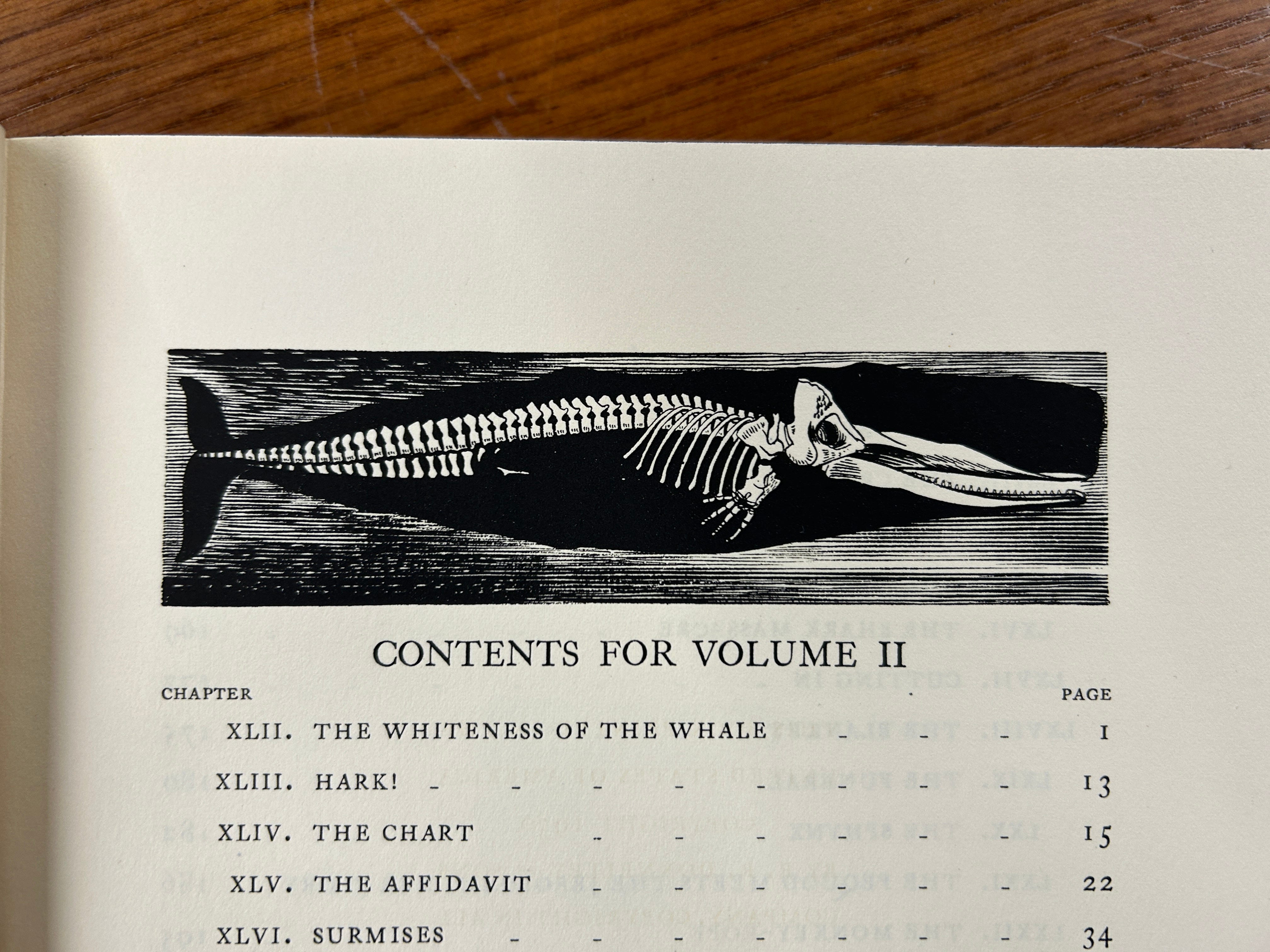
Returning to Volume II we have another header image from the table of contents missing from the trade editions, the sperm whale skeleton illuminated in front of its “prodigious bulk” of flesh.
Just behind that page is another missing image, the shining doubloon nailed to the mast. It seems like the Lakeside Press used it as a kind of ‘filler’ on an otherwise blank page. Here’s a side-by-side of the two copies.
And a closeup of the doubloon:
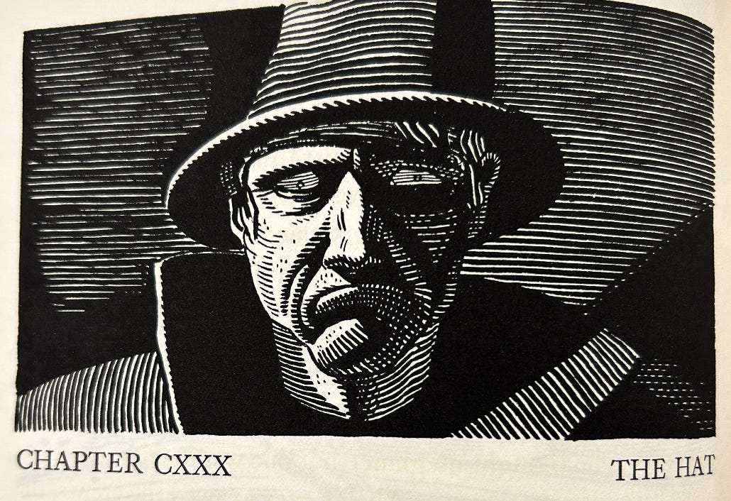
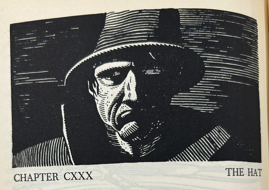
To pause for another moment, it’s really worth emphasizing how Kent’s already-astonishing illustrations that much more spectacular at full size. Just look at this classic image of Ahab.
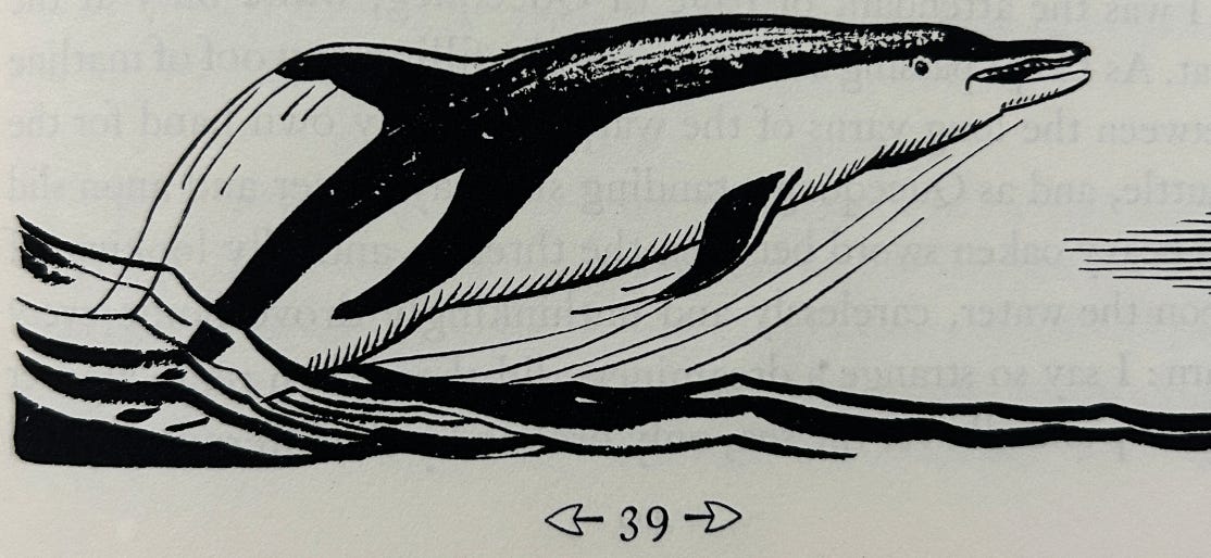
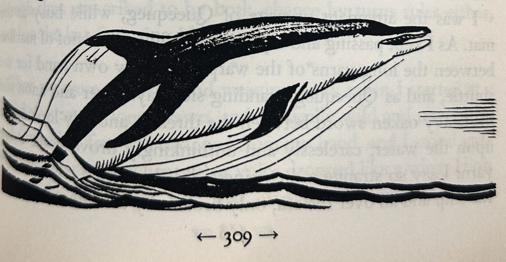
There are also at least a few printing errors in the trade editions. While I didn’t do a complete inch-by-inch comparison throughout, see for example the porpoise from Chapter 46 and the placement of its eye in the original (top) and trades (bottom).
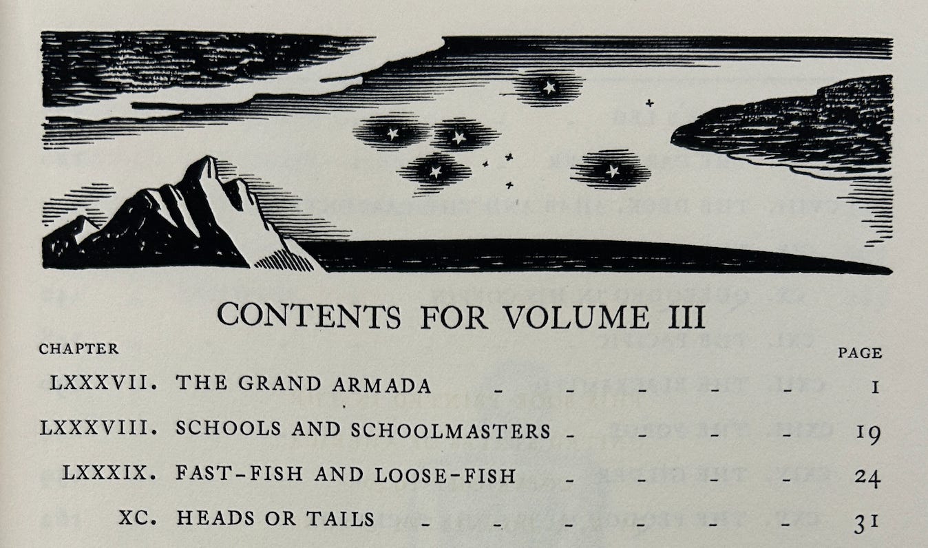
In Volume III, we once again have a header for the table of contents, this time a starry sky above a rocky island.
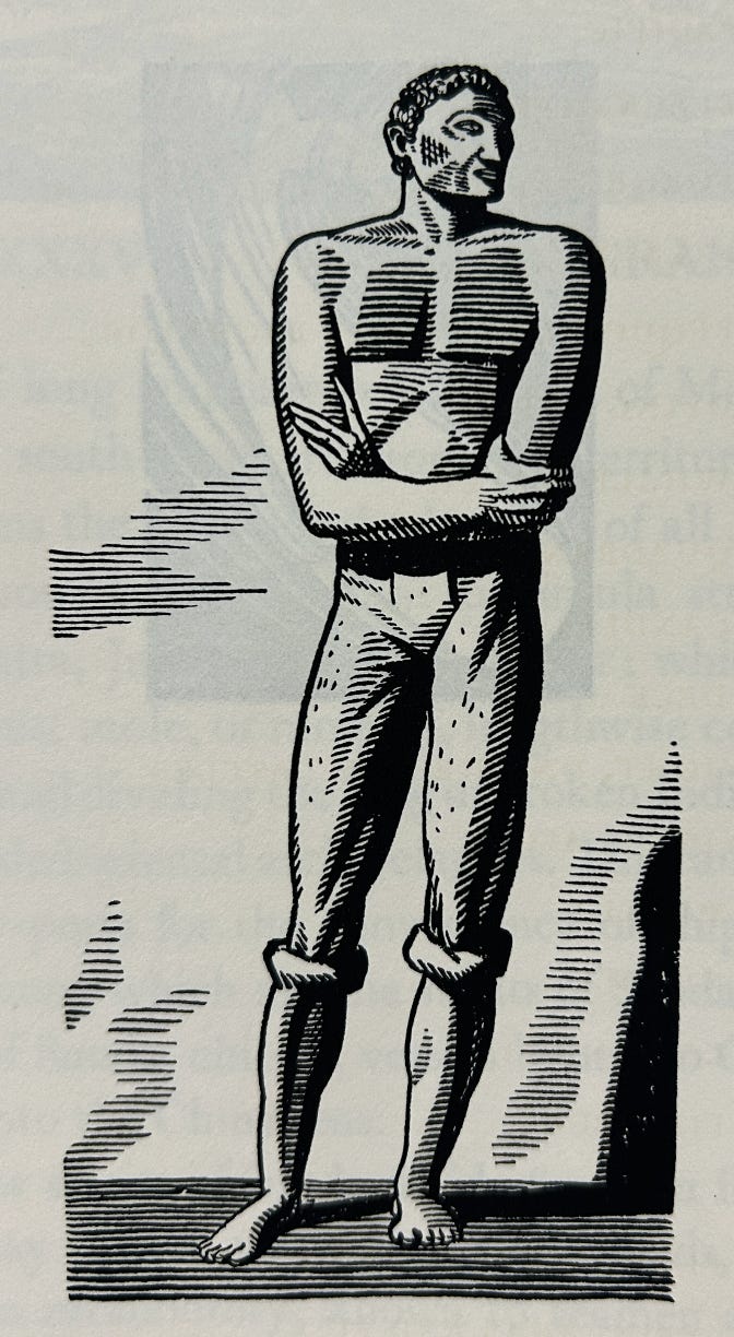
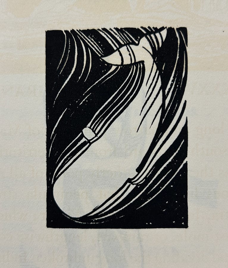
There’s another missing image at the end of the table of contents of who I’m assuming is Daggoo (note the “ring-bolt” earrings).
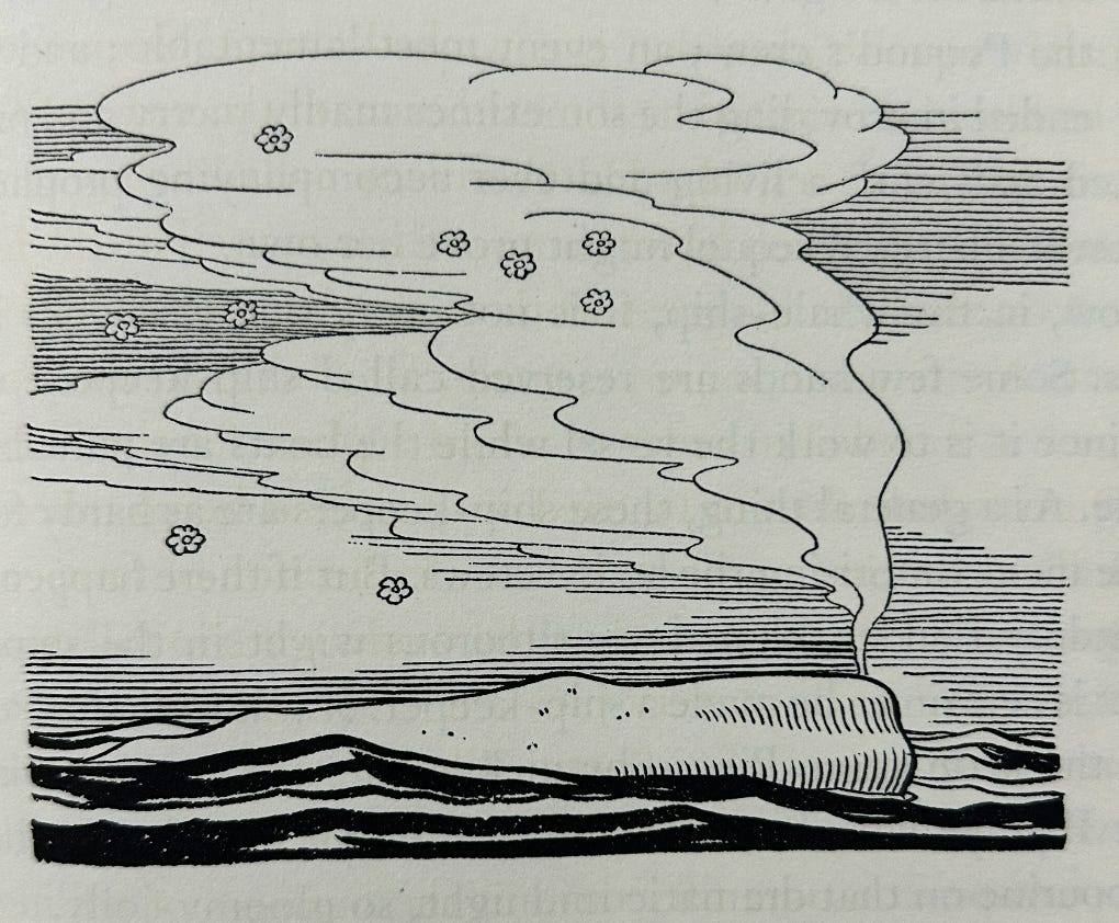
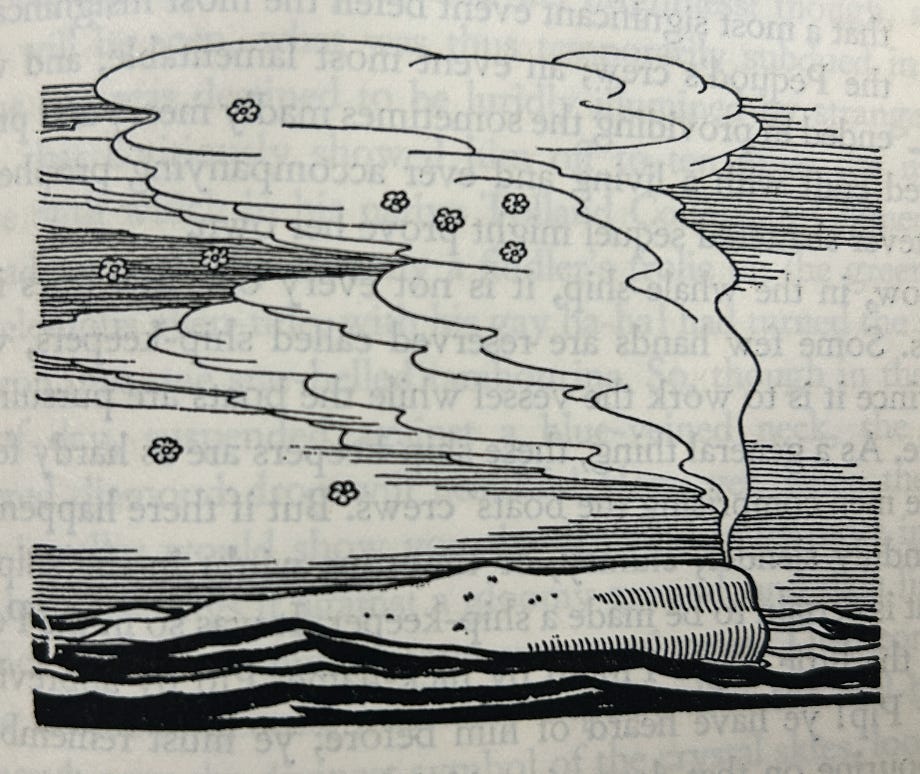
As we saw in Volume II, this page is followed by yet another missing image which fills in the blank space before the first chapter, showing a top-down view of Moby Dick.
Here’s a closeup:
Note again in this view of Moby Dick how much clearer and finer in detail the Lakeside edition (top) is compared to the much smaller trade editions (bottom), which also used thinner paper such that the text often bleeds through.
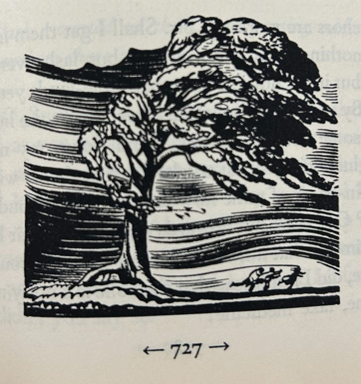
See also this windswept tree in the Lakeside Press:
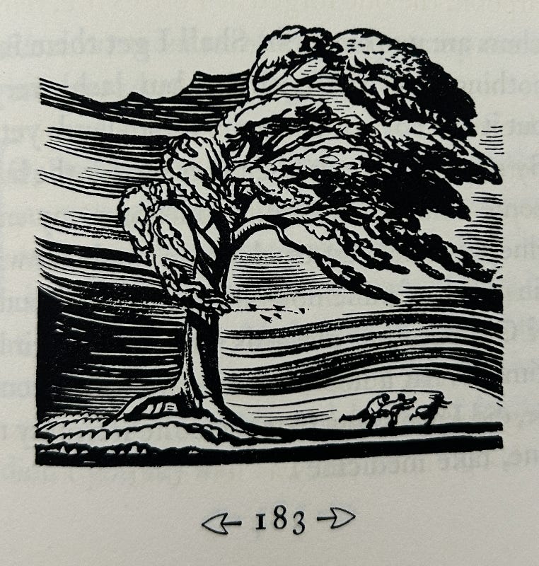
and in the Random House:
Lakeside:
Random House:
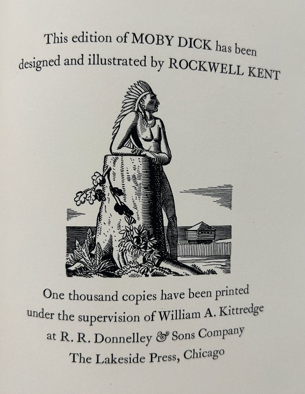
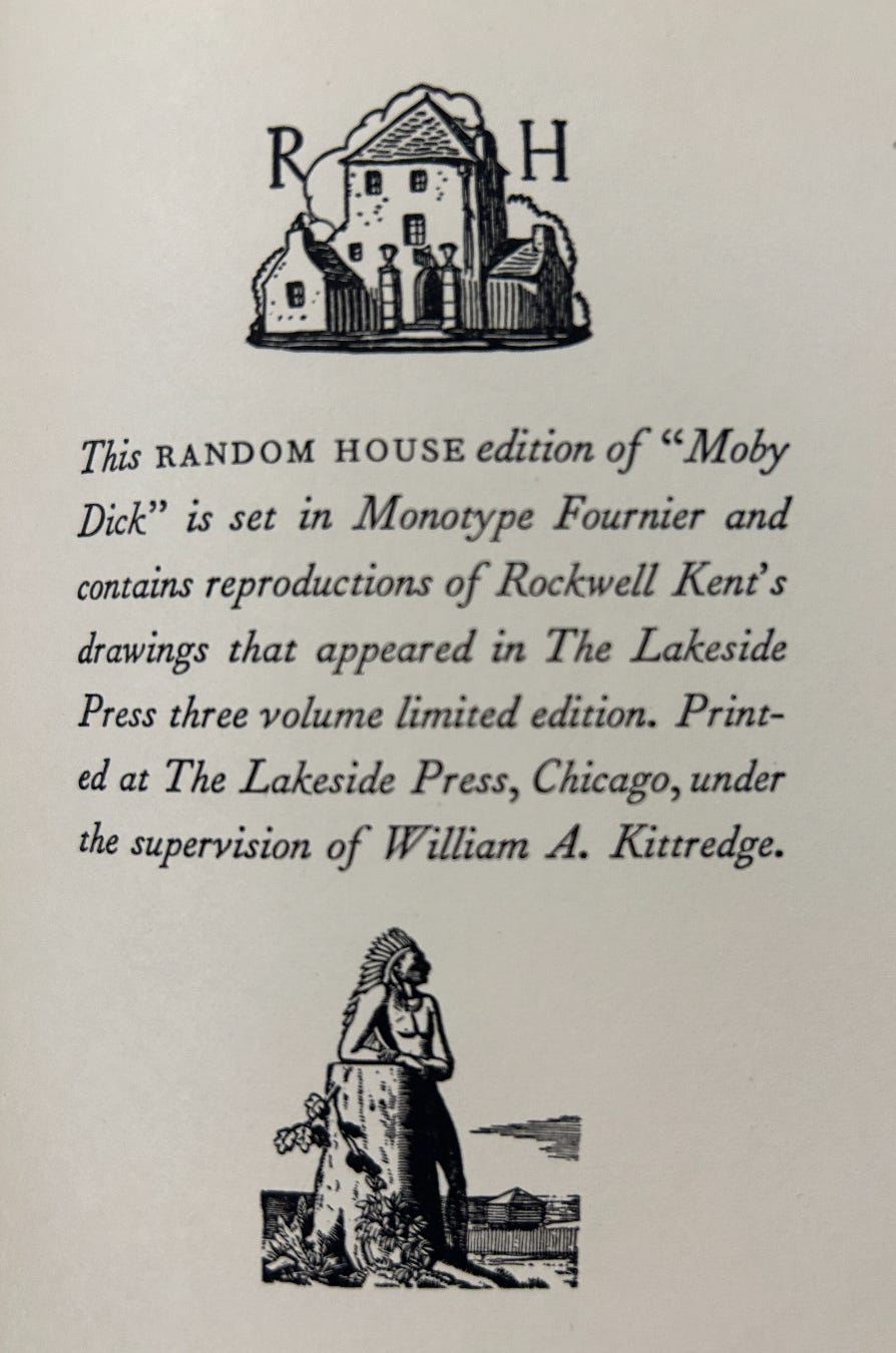
The final difference between the two, if minor, is on the colophon page in which the image of a Native American man is shrunk in the trades to fit the Random House logo, crushing out all of the detail.
Hopefully there will be a full-scale reproduction of the Lakeside Press edition coming out soon, complete with a heavy aluminum slipcase. I know I’ll first in line!
The Unused Illustrations
Ah, but that’s not all!
As I mentioned at the start, in May 1977 Kent’s biographer and and bibliographer Dan Burne Jones published an article in the Melville Society’s Extracts newsletter after discovering eight prints which Kent completed and sent to have engraved but which ultimately weren’t used in the book. Here’s what he wrote about their history and intended placement:
Recently, in collating a set of these engraver’s proofs with the illustrations as they appear in the three volumes, I found that the eight which decorate this article and the one on the cover of this issue of EXTRACTS had not been used.
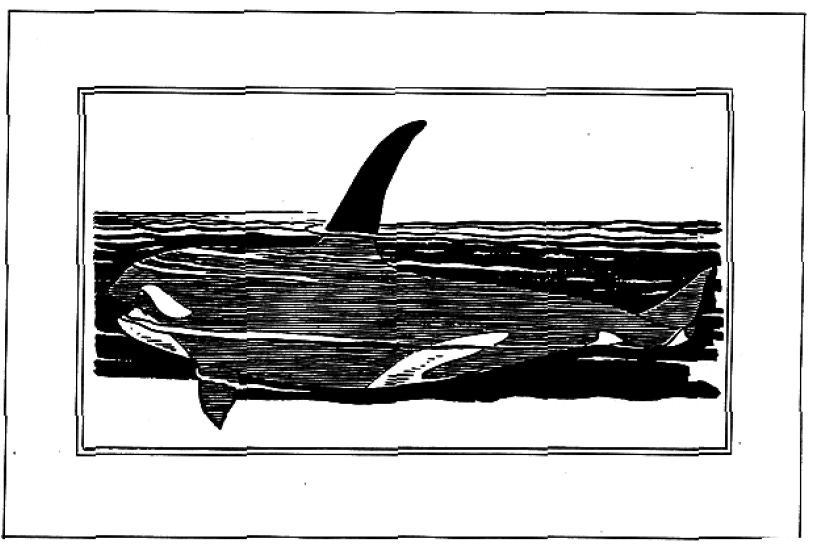
Because of the procedure followed while all the volumes were in work, all drawings were sent to the engraving sections of the plant, plates made, and proofs pulled from them. These proofs were matted and were sent out for exhibit by the American Federation of Arts to various universities and colleges; the labels on the backs of the mats attest to this fact. Judging from the heights of the drawings all but one appear to have been drawn for chapter headings; though they vary, their widths remain constant to the type page. The height variances of the chapter heading drawings throughout the three volumes add to the variety of the illustrative matter, as do the full-page drawings which off-set the full pages of type. The one drawing, though it is the width of the type page, is of a shark or killer whale in side view, with a fin above the water; the areas above and below it, being white, might suggest that it was intended for a tailpiece drawing.
Although former editor of Extracts John Bryant long ago scanned and uploaded all of the old newsletters many years ago, I thought it would be worth getting a higher resolution scan for this post and ordered an upgrade from the Newberry Library in Chicago which has a complete set among their vast Melville archives.
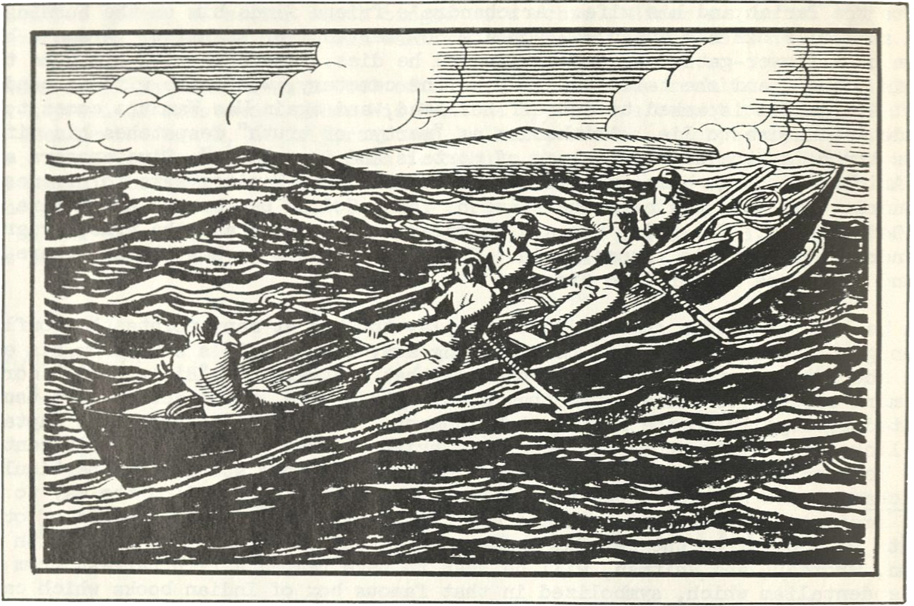
The first image in the article, used as a header, is a whale boat in hot pursuit of a whale. I would guess the boat is led by Stubb based only on the appearance of what looks to be Tashtego, his harpooner, at the front, though possibly the figures are just generic sailors. If it is Stubb’s boat, perhaps the image was intended to illustrate Chapter 61: Stubb Kills a Whale?
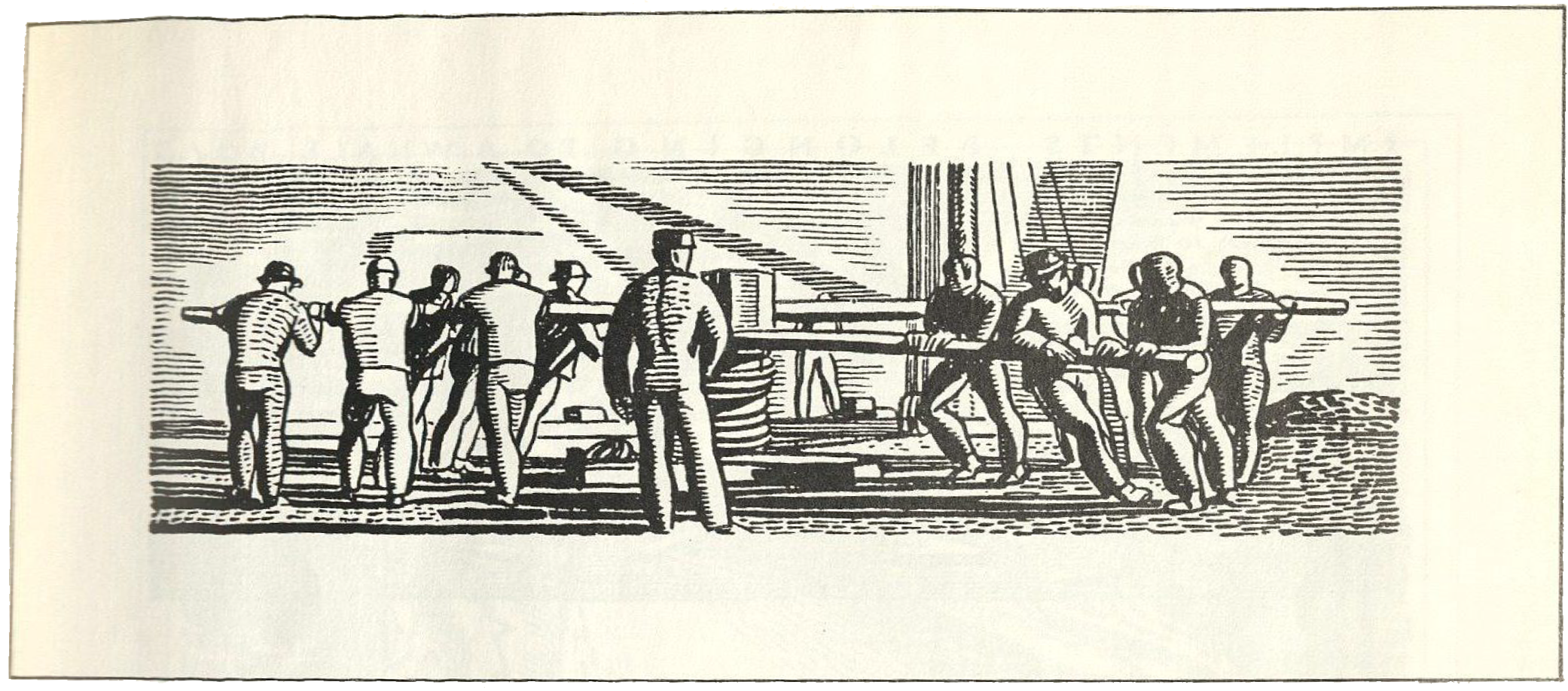
The scene in the next image is much clearer, showing a team of a dozen men heaving up the anchor by turning round and round the capstan. We examined this moment in the book way back in June 2024 trying to determine which sea shanty they were singing longing for those “Girls of Booble Alley.”
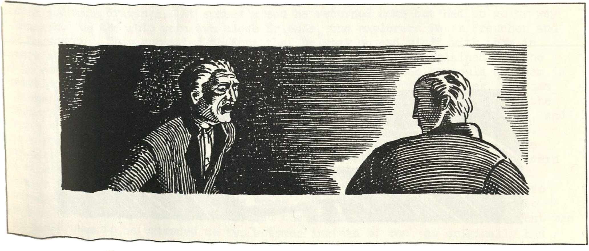
Another lost scene shows Ahab in a confrontation with Starbuck, maybe illustrating Chapter 109: Ahab and Starbuck in the Cabin before Ahab picks up the musket?
An illustration labeled “Implements Belonging to a Whale Boat” shows 21 tools and devices strewn about the deck with a number and corresponding description.
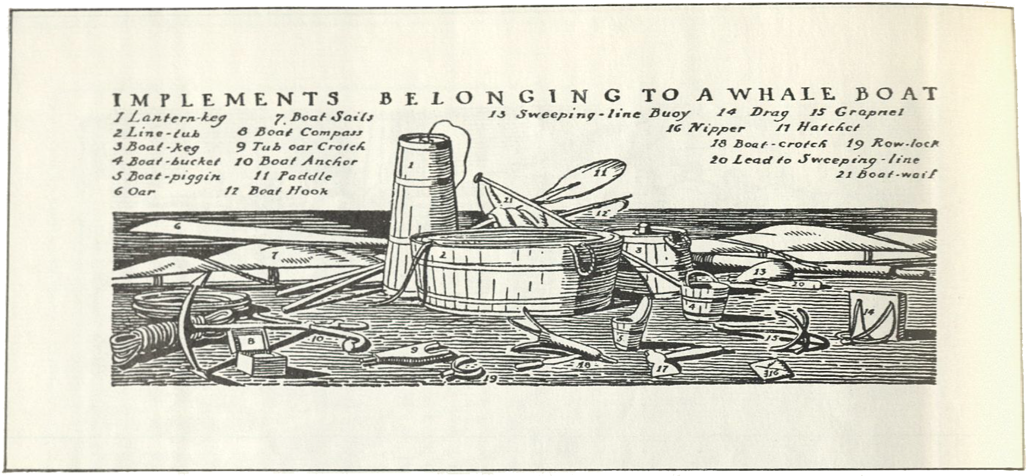
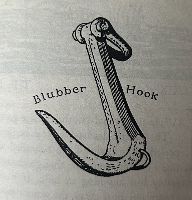
Kent did end up including several tools with labels in the book, but did so individually and closer to the part of the text in which they appear, such as the blubber hook in Chapter 68: The Blanket.
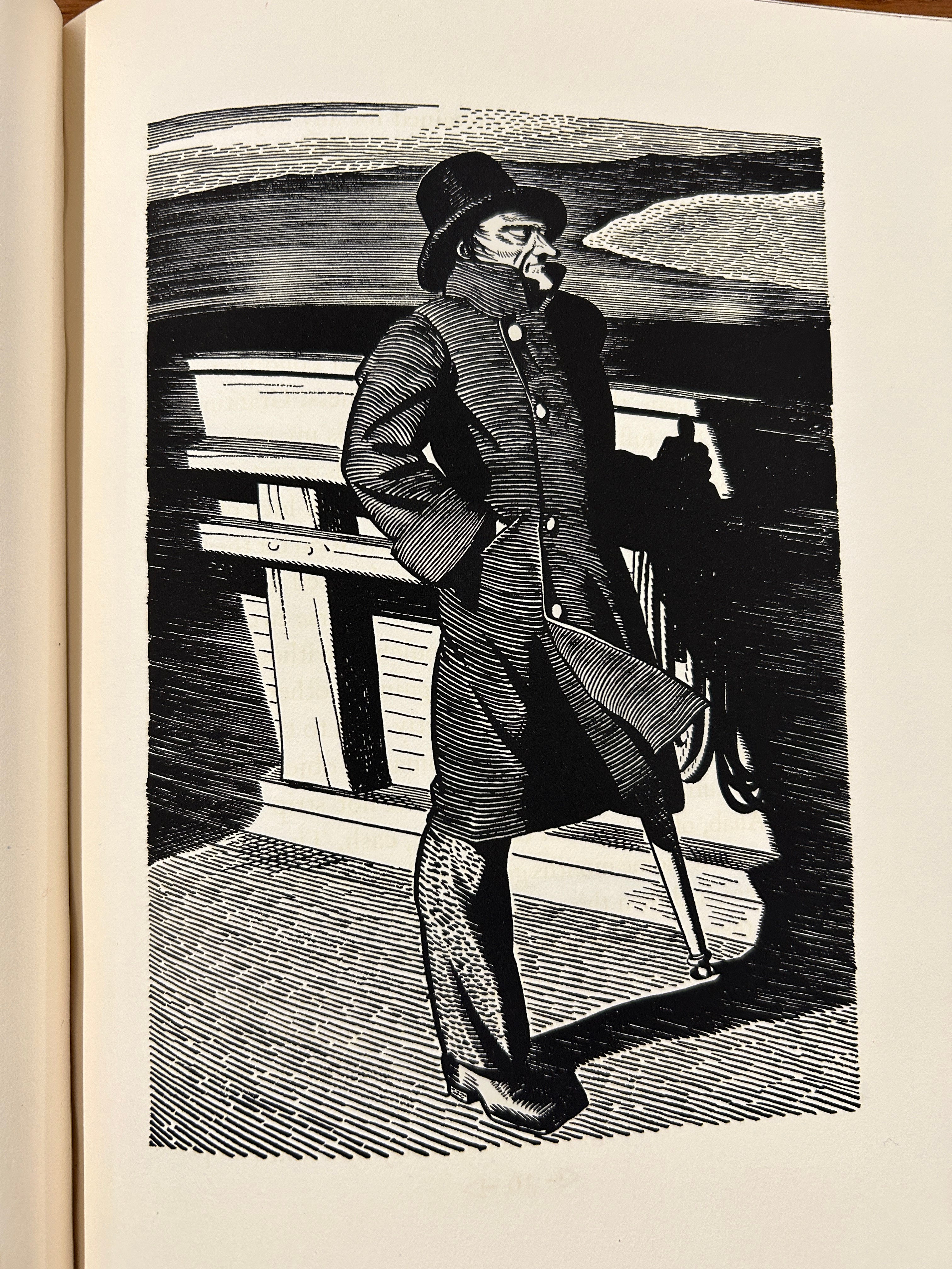
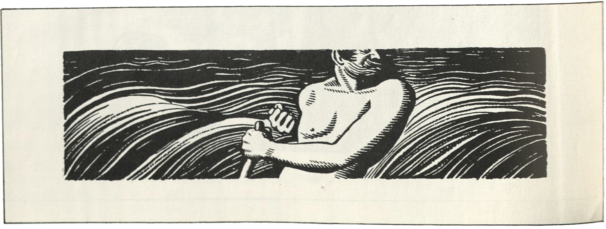
Another unused image is this one of a shirtless man at the ship’s wheel, though it’s unclear who this is supposed to be.
Kent’s illustrations in the book primarily show Moby Dick in the midst of some vicious attack on a whale boat or looming menacingly beneath the surface of the water. I don’t know why he chose to discard this angle though perhaps the realism ultimately made him look somewhat ordinary and indistinct.
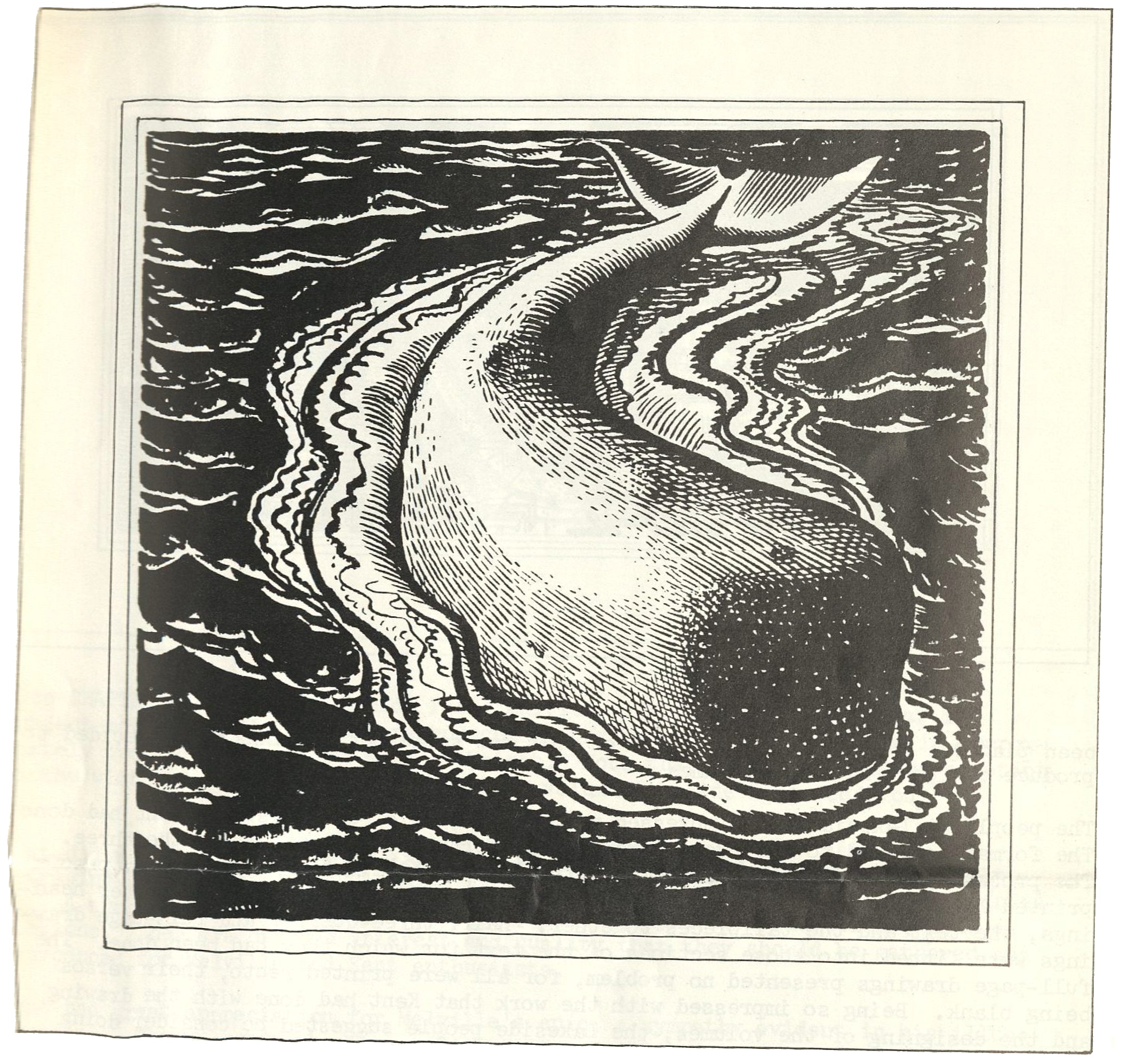
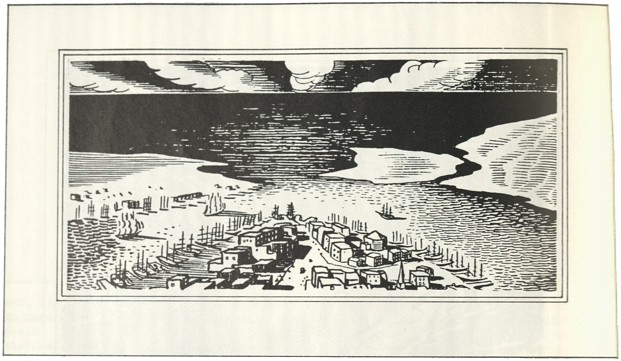
I’m also not entirely clear if this was meant to be New Bedford or Nantucket, though I would guess it’s the latter as there is already an illustration of New Bedford in Chapter 2: The Spouter-Inn and none of Nantucket.
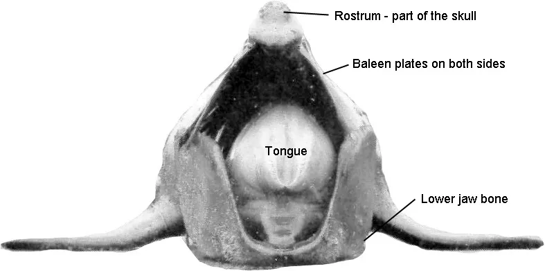
It’s not hard to guess why Kent or maybe his editor nixed this illustration looking head-on at a right whale. It’s not that he failed to capture this bizarre looking creature—see here for a comparison to a labeled photo/diagram—but the angle does make it hard to parse at a glance or even a good long stare.
Finally, the Melville Society Extracts used this ninth image on the cover of the issue, a profile of a killer whale I’d assume to illustrate Chapter 32: Cetology or maybe just fill in space where needed. (I forgot to ask the Newberry Museum to include the page when I requested the article scan so this is from John Bryant’s scan).
Dan Burne Jones adds that there are many more drafts and sketches that Kent chose not to complete which “have turned up in public and private collections.” Presumably some of these have ended up in the Plattsburgh Museum’s archives as well, but until I find myself near the New York-Québec border these 20 additions to the catalog will have to suffice.
That’s all I’ve got for this week. Happy new year, and happy year of Rockwell Kent!
The difference in quality between editions is striking! Thank you for sharing the high quality skans and the history of the illustrations as well.
Wow! Thanks so much for sharing these high-quality scans; they're gorgeous! And the difference between the paperback images and the originals really is stark – the one for Chapter 130 looks like an entirely different sketch.